Tom has decreed (and I agree, for what it’s worth) that the Q23 front page nav will go here:
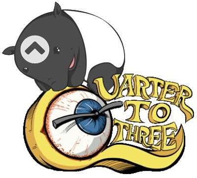
That will be the standard q23 eyeball logo which represents the front page. Clicking it will… wait for it… take you to the q23 front page at Quarter to Three - All games, all the time. Except for the bits about movies.
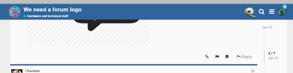
So that means the logo at the far left, which represents the forum, and is already (incorrectly) the q23 eyeball, needs to change. We need to help Tom build a logo that specifically represents The Quarter To Three Forums.
Which then raises the question, what’s the best icon for the left side of the screen to represent going to the top level of the forum?
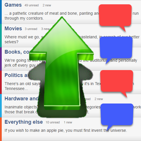
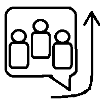
Well, forums are generally represented by some kind of “talk bubble” like so:
Tom said:
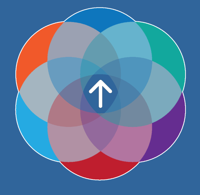
So, yeah, let’s go with the eyeball icon going to the front page and a new icon in the upper left for the forum. How about some sort of up arrow, implying going to the top?
Turn Up Icon | Font Awesome
Arrow Up Icon | Font Awesome
Up Long Icon | Font Awesome
Square Caret Up Icon | Font Awesome
Circle Chevron Up Icon | Font AwesomeI kind of like that last one, the chevron/circle up, as a counterpart to the eyeball on the other side of the page. What do you guys think?

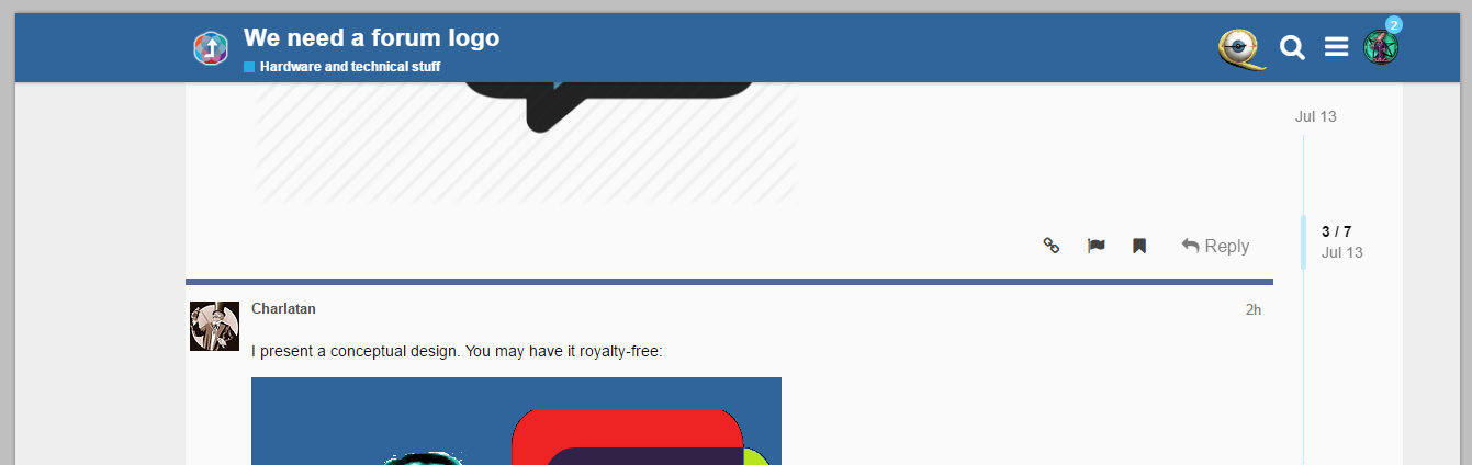
So, if you are feeling artistic, whip up something that represents “the q23 forums” specifically, more than just the q23 eyeball, which represents the q23 homepage.
Of course Tom has absolute final say in all of this, but I thought it would be nice to open it up to the community and see what we can brainstorm together for Tom to peek at. Whip up your best effort in the paint program of your choice and let’s see what happens!