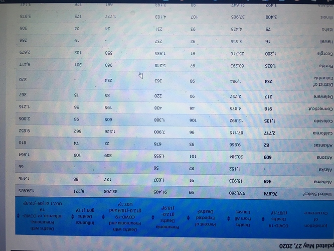
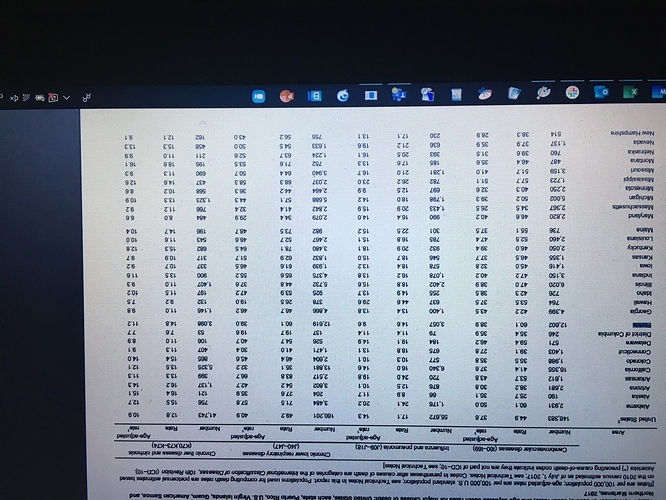
With the fluctuations and spikes in Fairfax County’s reporting (which is really, really something that shouldn’t be happening in one of the tech and science hubs of the Mid-Atlantic…) even a 3-day rolling average is going to be a little bit deceptive. I’m interested to see what the 7-day will look like though.
Well this has the death rate for flue/pneumonia combined and yearly those combined are half of the death from pneumonia cases for Feb to Present this year in Florida.
https://www.cdc.gov/nchs/pressroom/sosmap/flu_pneumonia_mortality/flu_pneumonia.htm
Everyone wearing face masks and people being buried in cardboard boxes. James Cameron really nailed those first 10 minutes of Avatar.
Actually if you check, it does give the numbers, and it appears those numbers for Florida are direct from CDC
Now I only see current deaths, but that is from table 2 under daily update of totals by week and state.
However looking through the CDC site I see the data for pneumonia for 2017, for the year. And Florida had 3057 deaths in all of 2017 for pneumonia.
Now caveats, that was an entire year of data, not 4 months normalized for time of year. Is a single year, so can’t be compared to total trend line (was 2017 better or worse than normal?), however the general idea seems to match what that person stated. If you break down the yearly average 900-1000 is roughly within what you would expect for the period we are talking.
So yeah, 5000+ is a notable increase above baseline, and indicates that there is some serious undercount.
Edit: sorry about photos inverting, I don’t know why and it isn’t letting me flip them.
I prefer Trevor Bedford’s more nuanced take:
The preprint paper in question does appear to have been written by virologists, incidentally. Indeed, the more I read about the authors the more I find your post arrogant, dismissive, and frankly utterly bizarre.
If you’re still at your computer the Snipping app in Windows is really handy for copy/pasting into Discourse. Sorry if this is “no shit” info but a lot of people I know aren’t familiar with it.
The 7 and 14 day are the other two lines…
If you haven’t tried Greenshot, which is free, it’s so, so much better than Window’s Snipping Tool.
I haven’t heard of that. I’ve just used the snipping tool because it’s already included in Windows and it mostly does what I want.
I’ll check that out, thanks!
Yes, I know. I am interested in a 7-day rolling in which the spikes in case counts appear in the first 2-3 days.
That CDC site has the last 5 years.
2719
2676
2808
3057
3091
So 5 year average is 2870
This year 5185
So difference is ~ 2300 excess ‘flu’ deaths.
Seems weird.
You also have to account for those being full year totals versus partial year totals.
5000+ over 4 months is a significantly different change than 5000+ over 12 months.
So basically cut the yearly totals by 3.
But thanks, for some reason I wasn’t getting all year totals when I looked, it just returned that one year. And I didn’t feel like spending more time given I had already seen enough to view the data presented as at least reasonable.
The Russian Method was effective until it wasn’t.
Everyone knows I’m a covid19 denier.
Welp…
![]()
WTG, USA! 💯
#MADA Making America Dead Again

Ok here are some Reddit folk commenting on a news story about Kentucky reporting as pneumonia as well:
And there’s some good links to more data.
Especially this link:
https://www.cdc.gov/nchs/nvss/vsrr/covid19/excess_deaths.htm
Sorry, Android copy fail there for a second.


