Regarding the gradient – there are some aspects of the CSS that seem to affect desktop and mobile and others that only affect one or the other. I must not have noticed that the gradient is one of those that only affects the desktop. I’ll take a look at it later.
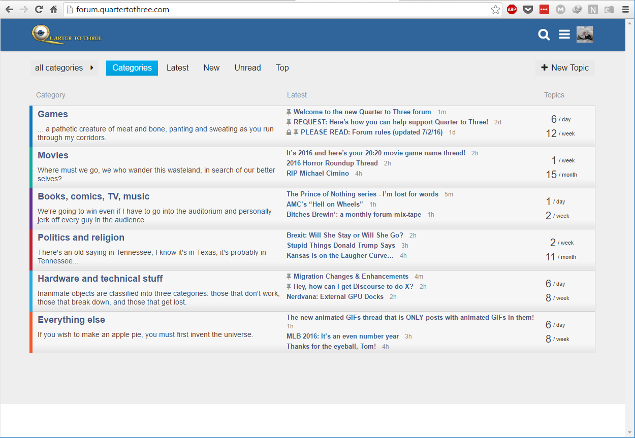
On the forum home page there is a white bar at the bottom of the screen at higher resolutions.
(See screenshot)
Is it possible/feasible to get some user-info displayed in-line with posts (I’m particularly thinking of location, which was sometimes handy anywhere from P&R to sports threads, but I guess post-count would also be traditional, along with default user-titles)?
Not as much fun to have to click through for all that. . .
Funny that given how many weird little cluttery elements Discourse introduces, I still find myself missing the added information that was “unique” to vB (in a two-way comparison, at least).
I don’t think that is a CSS change. Clicking the user profile pic to see the user card isn’t enough?
Yeah, figured it probably wasn’t, but wasn’t sure if the data was “loaded” (and accessible) by default, or only on-click.
Anyway, certainly can click away, but I do miss the old way, essentially :)
The user card only shows join date, # of posts in the particular topic and time of last post. Location and post count aren’t on it.
Location is, if filled out in your profile:

Lack of post count is a deliberate design decision to discourage long-time posters earning (arguably the perception) greater weight in discussions. Post count should not decide or have a bearing on the value of posted content.
I just put this up on the test site. Have a look. If you don’t see it, you may need to do a hard refresh. https://forum.qt3.us/

Opinions @tomchick?
Edit: I disabled it for now so that the CSS there would have parity with this site, to make it easier to fix some other lingering issues.
So sexy. . .
So much better, although I’d kind of like something other than whitespace to separate the topic starter and start time.
I think this is fixed now… If you view embedded posts, the avatar and post-separation bar shouldn’t overlap.
Update: while there’s no overlap of the avatar now, the style of the post separator make it appear as if the post embedded above actually is a child of the previous post, which is incorrect, obviously. It will require some tweaking, but this particular change seems to have some cascading effects. I’ll try to take a more comprehensive look at it tomorrow.
Love the ‘minimal’ topic list screenshot.
This is looking great now. Many thanks :)
(In general, honestly, Clay/wumpus/arpal/etc.; you guys are great!)
Expanding replies above and below looks much better now! Great work. I am sure we will have many future tweaks. The next one I’d aim for is the topic state changes (closed, opens, split, etc) being the same width as the rest of the post via media queries.
I’ll take care of that in the morning. I’ll also look at some of the other little CSS bugs.
So hawt.
-Tom
Does this translate to “Please make it happen ASAP!” ?
Unless I’m missing something, it looks like it’s already happened. How is the current view different from the test forum?
-Tom
I reverted the test forum. The screenshot in my earlier post is the point of comparison.