Dank Memes n' Dark Themes

Continuing the discussion from Hey, how can I get Discourse to do X?:

While

  • I believe 100% in the ability for users to style their own browser however they want
  • we will eventually get to per-user theme choices in Discourse

I wanted to discuss this idea that white-on-black text is somehow Bad For Human Beings™.

But the backlighting! Phththrheptpthtpbrp!

First of all, don’t run your monitor at retina-scorching brightness. Every monitor I’ve ever used comes shipped from the factory at near-surface-of-the-sun brightness levels (among other bad defaults) because that’s what “sells” on the showroom floor. So, calibrate your display. It is almost certainly set too bright out of the box.

http://www.codinghorror.com/blog/2007/09/computer-display-calibration-101.html

As I recall, mine are currently at 20% brightness. And that is plenty bright.

Also, look into bias lighting.
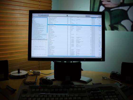
It is one IKEA away from working, and I use it.

The only reason they don’t print books white on black is because ink! Phththrheptpthtpbrp!

I find your beliefs fascinating, but let’s see what the data says, yes?

http://www.laurenscharff.com/research/survreslts.html

As you can see, the most readable color combination is black text on white background; overall, there is a stronger preference for any combination containing black. The two least readable combinations were red on green and fuchsia on blue. White on blue and red on yellow were ranked fairly high, while green on yellow and white on fuchsia were ranked fairly low. All others fell somewhere between these extremes. Also, in every color combination surveyed, the darker text on a lighter background was rated more readable than its inverse (e.g. blue text on white background ranked higher then white text on blue background).

http://www.laurenscharff.com/research/AHNCUR.html

From these results, one can say that contrast affects legibility, but unfortunately, it does not seem to be as simple as high contrast being better than low contrast. In the main experiment, Green on Yellow had the fastest RT’s, and in the control experiment, medium gray, and dark gray had the fastest RT’s. In neither experiment did the Black on White condition show the fastest RT’s. These results show that these participants had faster response times when more median contrasts were used. These results supported Powell (1990), who suggested avoiding sharp contrasts, but did not fully support Rivlen et al (1990), who suggested maintaining high contrast.

According to a manual by AT&T; (1989), the direction of the contrast (dark on light, or light on dark) might also affect legibility. When light text is placed on a dark background the text may seem to glow and become blurred; this is referred to as halation, and it may make the text harder to read. Some evidence for an effect of halation was found in the current experiment.

It is definitely true that too much contrast can be a bad thing, that is, it’s generally better to have a not-pure-white background. In other words “book pages aren’t pure white”. That’s true, and correct.

But as for why most text on the web is black characters on a white background… well, that’s because the data shows it’s the most readable kind of text there is.
I’d like a night theme please. I always run pretty much everything looks that. On a mobile device with an oled display, it even saves battery power 🐙

First off, self theming with style managers and CSS tweaks isn’t an option for those of us who read on iOS devices.

Secondly, for those of us who want to read the forum in the dark without scorching our retinas, optimised reading legibility drops way down on the list of concerns. And bias lighting is again impossible on mobile.

Your priorities on this stand in stark contrast to the overall trends in app development. More and more apps are allowing user choice for the reason that people are less and less likely to be sitting at a desk, with perfect bias lighting, while consuming their preferred content. Cases in point: Overcast, Reeder, Tapatalk, Marvin, and Tweetbot. All considered to be best in class design-wise. And all offer “dark themes”. For someone who is so forward thinking when it comes to forum software, it surprises me how backward thinking you seem to be on light on dark reading in appropriate contexts.

To be clear, I am not against user theming choice! Choice is good!

What I am against is all the “oh god your black text on a white background default is EYEBALL GENOCIDE!!1!@!one” talk.

Seems credible, at least How Much Power Does A Black Interface Really Save On AMOLED Displays?

Not much testing around this on newer devices though.

Yeah, but like that article says, it’s kind of evident, given how amoled displays work. That article is pretty cool though, because honestly i didn’t exist the savings to be that big.

I just like black interfaces

What about white on gray or black on gray? I like these both and use the latter for my website. I think Qt3 is too high contrast.

Readability has nothing to do with it for me. I’d most likely run a light theme on desktop/laptop. It has everything to do with the fact that if I’m reading QT3 (or any website for that matter) in bed, I’m holding a screen a couple of inches from my face. It would be nice if most of that screen was dark rather than light.

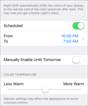
Isn’t f.lux integrated into iOS now as “night shift”? Why not use that? Shouldn’t Android do the same, since they copy everything Apple does?

ducks

edit: hey! you too @Ephraim since you said “on iOS”!

I think Android N is getting a proper night mode, but at the moment, no. I use Twilight, but it doesn’t work for this. Also, having a dark theme to begin with is better than ameliorating a light theme.

Bright monitors, or indeed any large contrasty objects, do not work with my cave troll eyes. I remember once, at uni, going over to a friend’s house. When I opened the door to this room, my eyes nearly exploded…

He had some giant monitor on full brightness and absolutely no other lighting in the room. I couldn’t even look in the general direction of the monitor, it was that contrasty and brightwithout, my eyes watering. And his guy? He had his face about 1 inch from the screen playing (badly) World In Conflict. HOW?!?!

Then again I think my cave troll eyes are a bit too sensitive. e.g. when I had an eye sight exam and the guy had his little stick light thing on the lowest setting, and shining it into my eyes in a dark room was akin to waterboarding. (Other eye exams have gone fine, I think this guy just had some mag torch for an inspection light. Also I bring up the sensitivity and each time nlne of them say it’s a real problem).

I recently started a new job, and one of the first things I did was calibrate the monitor with multiple tools etc. Really improved the reading experience. (Though to properly calibrate you need an external physical tool). Still, the brightness ends up on like 20/100. My home monitor is 7/100 on the brightness scale. I rarely have to adjust them for night time as I use f.lux etc to take away the blue at nights. It really helps.

And whilst I did used greyfolio on the old site, I guess I just don’t understand white on black in general. A lot of people I know use white on black for vim sessions etc. But afaict, unless you go fully black and never go back, your eyes explode every time you change from white-on-black to anything black-on-white… I.e. the rest of the computer’a windows. Or at least, mine do.

(Again this could just be my super sensitive eyes. If I go from wob to bow I get a kind of ‘scanlines’ effect from having read all those piercing white lines. I really hate it when I come across a BOW website due to this).

Are my eyes just super sensitive or is it common?

Yes, and I use Night Shift cranked to the max. But when the vast majority of the screen is white, it only takes you so far. My phone is still, very visibly, able to illuminate my bedroom. If my wife happens to be in bed before me on a given night, I can use Qt3 (in full Night Shift blue light reduction and at lowest screen brightness) to guide my way in the dark. Ugh.

Would you like to know what was perfect and didn’t disturb my spouse or hurt my eyes to look at in the dark? tapatalk’s night theme. It was white text, which Night Shifted to a nice blue-free yellowish white, on grey. So, yes, I took advantage of night shift, but it was complementary to a dark theme. Reduced brightness and eliminating blue Isn’t enough.

What I can, and sometimes do, use is the iOS accessibility setting called “invert colours”. Which globally switches everything. It makes images look horrible, but at least Qt3 doesn’t set my vampire friend’s skin aflame anymore. The only problem with that is that, for reasons only Apple knows, Night Shift and Invert Colours don’t work together. When I activate the invert colours mode, which I’ve made my triple click the home button shortcut, the white text gets noticeably more blue hued. Which is more harsh than I’d like.

All this to say that I don’t even want fancy theming support. I just think that any well designed text reading experience, in the modern mobile world, should have a “dark mode”. I leave it to the designers to make an informed decision about how to best do that. If it is by implementing that Solarized colour theme that @stusser enjoys, great. If it’s just a white on black, fine. I can live with that because it all works well in tandem with Night Shift.

What’s worse when reading in the dark is small fonts. Look at Ephraim’s wall of text. The black on white is too blinding even with Night Shift. The invert is blinding because of the bright white text.

(I miss Tapatalk now)

I don’t feel super strongly about this particular topic, but I do think @wumpus has a tendency to look at data points that say “X is best for a majority of users” as absolutes, even when there’s a substantial minority even within that data set for whom that choice isn’t preferred. This has happened for several issues during the migration. In all of those cases, the default Discourse behavior is probably the best for the majority… but also in all of those cases, if a third of your user base doesn’t behave that way, it doesn’t mean they’re objectively wrong or that the supporting data is wrong. It just means that they fall into the minority.

(I will now slink out, as a mostly satisfied dark-on-light reader who would previously switch to dark theme for late nights on the big monitor, but doesn’t miss it as much as most!)

As a minor data point re the Twilight suggestion, because in Android it is an app and not a phone level setting, it’s fluxifying powers are limited. Particularly, whenever Chrome is open, the red tinting effect is disabled immediately, so I can’t even ameliorate the appearance of Discourse on my device. And I was a “standard” theme dude on desktop who loves the current theme on the same! It’s just monumentally unpleasant to use on mobile in the evening.

We’re all smart enough to turn down our monitor brightness, use flux or equivalent when available, and guess what? A dark theme is still preferable for many of us. At night, in a dark room, even a warm & muted light background is less pleasant than a dark background. Ephraim’s example, of illuminating a dark room and annoying your spouse to no end is on point, use of mobile flux-alike’s notwithstanding.

No one is arguing that dark on light is inherently bad, that others find it preferable. Hey, most of us dark theme lobbyist may prefer dark on light many times, but not all the time. As krayzkrok said, a dark theme (solarized!) is more relaxing and cozy for evening reading, or while in a dark room.

Also, I don’t think anyone is complaining based on actual physical damage being possible. It is merely the fact that we are a large contingent of folks, many within the IT industry, where the trend is to dark themes (which does NOT mean black backgrounds with bright white text). Look at all recent editors and IDEs - Atom, Visual Studio Code, IDEA, etc., where a well-implemented dark theme is a major feature bullet point.

We just want our QT3 to mesh in nicely :)

It would be nice to have choices for how the forum is displayed. I can’t think of a negative other than perhaps it increases the maintenance load for the developer.

Discourse reminds me a bit of EverQuest. There were things in EQ that proved to be unpopular (forced grouping, downtime, waiting to get a bind after a boat ride, etc.) that probably did help the community engage better. Discourse doesn’t have an ignore feature because that violates some kind of forum community ideal Wumpus has in mind. Black text on white is the best, even when it’s not the best for some people.

As I’ve said multiple times, I am not opposed in any way to selectable user themes. Just so that is clear. As clear as an unmuddied lake. As clear as an azure sky of deepest summer.

Why do you insist on an eyeball apocalypse, wumpus?!