I was not a frequent Tapatalk user, although I did try it. I’d like to point out one thing to those complaining about its absence. Its presence on the old forum added a cost to everyone who didn’t use it, over and above the maintenance cost to Stusser with all the updates. It used to popup alert boxes every time you tried to view the forums in a regular web browser.
This is now complete. Suggested will look back 365 days max, once it has worked through all your tracked/watched and the new topics. Much better. Thanks to @arpit.jalan and Sam from our team for getting this in.
I agree that the “minimal” version looks much better-- I strongly prefer the last post column, with the avatar plus name of the last poster, and the time since the last post.
Two minor issues.
The double-line rows waste space. I would remove the thread starter and the time the thread was created. But since the last post column is two lines, perhaps the CSS could simply remove some of the whitespace to fit threads on the screen vertically.
There’s no category indicator. I want that in the “latest” view.
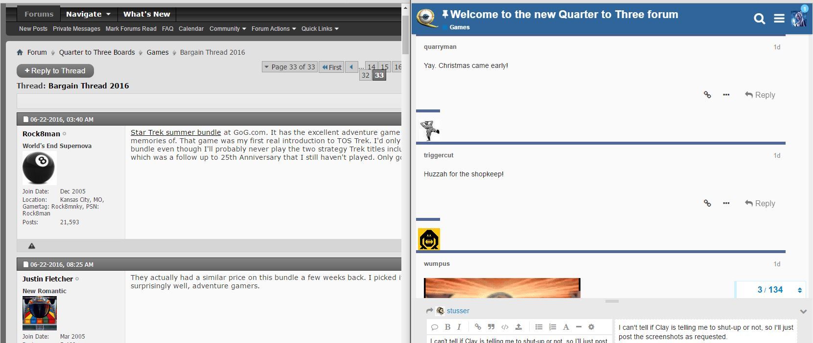
I can’t tell if Clay is telling me to shut-up or not, so I’ll just post the screenshots as requested. I got a feeling I am going to get a nasty retort about RGB colors being the same or something. All I know is maybe it’s the blue with teh white and the fact there are inches of wide open space now but it’s definitely lights up this room a lot more than the old page.
If the brightness bothers you check out the FAQ for some workarounds while the powers that be work towards a more permanent solution, which is hopefully on the cards.
I had no idea I was using a theme. I must have felt the same way years ago and changed it. I knew I wasn’t using the night theme though, so I just assumed I was using the default when the discussion about themes came up. .
Yeah, what mono said. That’s how I used the old boards and wonder what others are doing over here.
Although, I must say, I’ve been trying to just stick with the defaults and having new and unread is starting to grow on me. I especially like that I can narrow down to one day’s worth and see what’s topical today. I’m just curious what others are doing for day to day reading.
I used to go into a couple of categories and see some things at the top. This NEW section is showing me topics/subjects that are in categories I probably rarely looked at before… like the hardware. I consider this a good thing.