yeah, I lobbied for this as well, since it clearly display the name of first post and last post person, not just avatar, which was what everybody wanted but no one picked up on this when I shared this in a couple of threads. Since Sam implemented it and Sam is also doing the Qt3 migration, together with @arpit.jalan, maybe we can consider this? What do you think, @tomchick ?
They most certainly did show ads and yeah, this color scheme is intolerably bright right now, and is really driving me off, amongst all the weirdness of how Discourse works.
As it is right now, its a hassle understanding how to do anything for me on the forum, trying to find posts that are new, trying to find out who posted what and when - Honestly, I find the the forum a mess of icons, avatars and information right now.
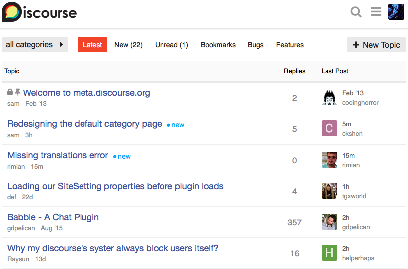
Wait, I’ve been told you can’t display the names. Actually maybe the point was just that you can’t remove the avatars. But, yes, I quite like that. Is that currently an option or just something this Sam Saffron fellow – who has nothing to do with our migration, BTW – is working on? @Clay, could we get the categories to look like that? In which case, it seems to weird to me that we can’t take out the icons.
Sam is a core member of the Discourse team. I’m uncertain whether he achieved that look solely through CSS or if he hacked/modded the innards. I’ll look into it, though.
Oh jesus. The infobar gets so much worse with use. Please, please make it go away. :(
Edit: Whoops. I guess I somehow accidentally expanded it into extra-terribleness. It’s still bad but it hasn’t gotten worse by default. Crisis averted.
Edit of edit: not accidentally. It’s expanding whenever I jump to the top of the topic. Can that be fixed at least?
It might be good to give it a few days at least before complaining too vocally about some features. Just to give time for things to settle down a bit post migration and for the users to start getting used to Discourse as a whole.
Then we could start discussing what works and what doesn’t. Knee jerk reactions right after a major change can be detrimental in the longer term.
So a lot of the profile summary doesn’t seem to be at all useful without likes and badges - I’ve added changing that to the list. I’d also remove Top Links, myself - I don’t see the point - but that at least is still enabled functionality.
I’d guess the confusion is that Discourse by default has no option to do this. However, all pages/views are built from templates and you can override them by injecting replacements in the admin. In theory you can make the forum look however you like. There is nothing stopping you from getting rid of avatars and displaying names only for instance.
Anyway, if you like Sam’s category page, he even provides the new template & CSS to make it look like that on the page that Habibi linked to. So Clay’s doesn’t even need to recreate it.
I really wish there was a slight moratorium on styling / functionality changes to give time for things to bed down. Otherwise, we seem to pick up random suggestions from random posters without taking the time to consider whether the change really benefits the majority of posters or not.
I agree with that. Of course, I would say the same thing about likes and badges – why not give them a try – but I know that’s an unpopular opinion around here.
One that I share, for the record. I really thought what Likes surfaced was a valid, alternative way to browse the forum. And badges were innocuous. But I know I’m firmly swimming against the tide on those.
Yes, this is my recommendation. Community is a years project, not a months project. So once we have resolved the major blocking stuff per Tom, and have a rough design that’s not too objectionable to too many people, giving people some time to absorb the existing changes is a good idea before getting too many wedged in at the last minute.
Choosing “themes” per user is an option, but it will take us a while to build that. My definition of “a while” is roughly 6-8 months, but don’t hold me to that. Just a rough estimate.
I would really like to get rid of the avatars in the category view and just go to names. And a darker theme would be a godsend.
But otherwise, we’re not going to be making any major changes for the time being. That’s what the weeks of running the test forum was for. Random suggestions are, of course, welcome, but we’re definitely not changing stuff willy-nilly. Have a look at the wiki at the top of this page for a sense of what’s on the table and not on the table at this point.
That said, once things stabilize, I’m willing to explore pretty much anything Discourse offers. You can all take that as you will. :)
Wait, where are they on? I’m not seeing them. We definitely should not be using likes and my opinion on them hasn’t changed, so they’re not on the table for now.