Just curious what you feel is the easiest font to read in MS Word is. I like the font on this forum a lot, but have no idea what it is.
Whatever it is, it doesn’t have serifs. Tell you that much.
I prefer Arial, which is what this forum looks like to me.
I’m using Arial right now, but the letters seem to be a tiny bit blockier/heavier (ever so slightly) than the forum font.
Maybe Helvetica? That one’s close.
More than likely you guys are seeing Helvetica or Arial, depending on what you’re viewing the forum on. They’re both long-lived standards for good reason.
I’d guess it depends somewhat on your browser. The stylesheet for the site specifies Helvetica as the default font, with Arial and other sans-serif fonts as backups.
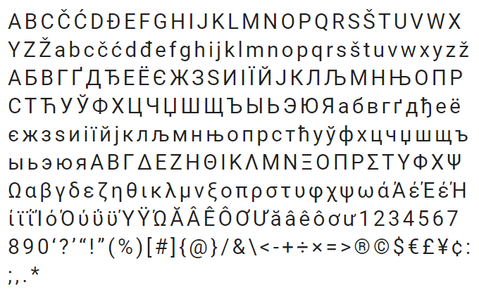
To answer the top-line question, for reading on a screen, I’m actually a pretty big fan of Google’s Roboto font, which is the system font for Android. To my aging eyes, the uniform line widths are just clearer and easier to read, and it looks modern without being tacky.

I don’t see that font as an option in Word, though.
You have to install it. SkyFonts, from fonts.com, is a font manager that will install and update google fonts for free, without creating an account.
My problem with fonts that don’t come by default is that when you send the document to someone else they don’t see it formatted the way you did. Unless you save it as a PDF or an image, of course. But that’s not always a very good option.
And @jpinard asked about Word fonts, so I assume he’s facing similar restraints.
For Word, I’ve been a fan of the new default since 2007 (I think it was, 2010 for sure) - Calibri.
![]()
I like Roboto too.
It’s no Papyrus, though.
Correct. I would have used Helvitica, but that’s not in Word either.
I’ve always been a fan of Times New Roman in print, but for the screen in Word, I swear by Bookman Old Style.
Ah, Comic Sans. Took you long enough, huh? ;)
I have always liked Geneva on screen, but I do not know if it is a Word font. It always seems to be around.
I got a pair of computer prescription eyeglasses which did make everything easier to see on the screen.
I’m a graphic designer and Verdana is my go-to screen typeface for a few reasons:
- It’s on pretty much every machine
- It’s wider than typefaces like Arial/Helvetica, Tahoma, Calibri etc. so is easier to read onscreen and at smaller sizes, particularly on lower resolution screens
- It’s sans serif with simple, clear letterforms (serifs can be problematic for dyslexics)
I insisted on this forum using it back when the style was being worked out but I think it got lost in the hubbub!
If you want a good serif screen typeface then I’d recommend Georgia for the same reasons. Give them a try @jpinard, I’m positive you’ll have them.
