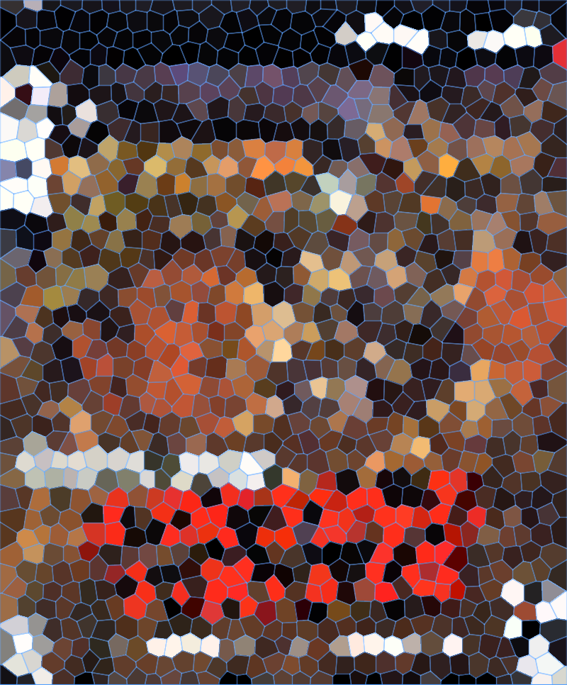
The Red Dot at the top is a clue.
Gary Grysby’s War in the Pacific.
Or a red herring from the way the filter processes colors ;)
Whichever the case is, it is not either game.
Under a Killing Moon?
I like this guess a lot.
I see why you would.
But it is not correct, sadly.

Rage?
Fury³?
I see what you are thinking, but neither is correct.
One guess was previously relatively close.
I think I know what my next guess is gonna be.
The Pandora Directive?
Close Combat 2 A bridge too far?

Well done! Kinda surprised this took as long to be honest.
Was that your ‘next guess’ or did the latest image change your thought?
1- How do you guys even remember the box cover of games you played 5,10 or 25 years ago?
2- How the heck do you match the bespeckled image to the box?
Squint.
This is literally what I do.
That wasn’t me, that was @anymunym ;)
In this particular case, I had that manual with me for my whole time servicing the military, hoping it would help me XD
That being said, I personally hate the mosaics: really can’t see a thing. Also I prefer when the game is focused on remembering details from boxes we were drooling over whence we couldn’t afford all the games we wanted - well, at least that was my case.
Speaking of which, back to black-boxing!

For Pool of Radiance, it was entirely due to the shade of gold it happened to be. And that was the only goldbox game that was predominantly “black” on the interior image (Azure Bonds having more blues/purples, etc.).
Mass Effect?