Big Activision sale right now. Lots of Sierra stuff, including city builders, and the later Zorks, Nemesis and Grand Inquisitor.
Yeah that’s basically it, but Etherlords 2 is in my opinion the much better CCG type game.
Just played it recently and still really enjoyed it.
Who changes their company logo (brand identity) unless it has become toxic? who does that? who advises it?
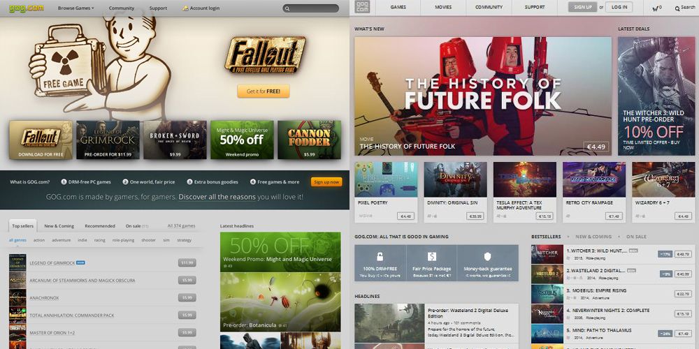
Sorry but this attempt to copy Steams/Windows 8 look just feels nasty, maybe the most nasty thing GOG has ever done. I hope we get a skin choice at some point (there has even been a post from a guy that suffers badly from depression now not being able to use their site as all the grey is depressing him more! serious!) to put the classic, original, distinctive colours back (i could live with the new format, once bugs are squished).
If that choice is never given by GOG themselves there are currently a number of hacks doing the rounds to change the look of the new site, so we can always do that.
Woah, Zak. It’s okay to just say, “Meh. Don’t like the new look.” You think they’re trying to launder the brand for some reason? Did you raise an army to protest Netflix reversing their logo from white on red to red on white? Clearly they’re hiding something!
Do you really hate Steam so much that you don’t even like things you believe look like Steam?
What company asks permission from its users to change the look of their site or logo? I kind of like the new look. It’s clean and not garish.
I’d say it isn’t so much a “Steam design” as it is an implementation of a flat/modern UI/metro design.
And when it comes to that, it’s a pretty established fact that a bunch of people hates it with a passion, another bunch of people is ok with it and yet another bunch loves it.
Personally, I generally hate modern UI with a passion, but I don’t think this particular implementation is so bad. The only thing I think is a bit ridiculous is that they jettisoned their established, color coded logo for this greyscale version.
rezaf
I love the new site’s look. It’s a mobile-friendly responsive design that looks so much better than the previous iteration, and is much more functional on a multitude of devices to boot, which is VERY important these days.
Nastier then when we all thought they closed the shop? ;)
Makes me feel great. The new design is clean, usable and very friendly. I might be looking at it with my SEO eyes though, but honestly I don’t see the problem. The new design is more modern, more flexible and in my opinion more usable, especially from a mobile standpoint, which is SUPER important these days.
Sadly their deals pages don’t seem to have been ported over to the new responsive design yet as they’re not mobile friendly at all, but I’ve let them know about it. ;)
I’m willing to bet that they are trying to unify the presentation of their website with the aesthetics of their soon-to-be released client.
What’s most annoying about the picture on the right is not the UI but the picture of two dudes wearing vacuum canisters on their heads. ;)
-Todd
I like the new GOG. It’s clean and organized, and it looks far more modern than the old site. The old site was starting to feel a little “Geocities” honestly. I like my games to be retro, not my websites.
Ohhh, I forgot about that, excellent call, you’re very likely right.
I find the new site too busy, less relaxing, less welcoming. Those last two are very subjective off course, but if i compare the old and the new i find all the info i need on the old with none of the clutter/busy look of the new.
Once they make it work properly, and add the old logo back (or i’ll hack that in myself) i’m sure it will be useable again…but currently…blerg! It’s gone all cheap and tacky looking :(
Are you looking at the site on Netscape too? ;) (sorry, couldn’t resist)
I should just add i hated Windows 8 ‘aesthetic’ so much i worked hard to buy Windows 7 instead. The same feeling applies across the many applications and sites that have gone with this same ‘look’ (i’ve decided to call it ‘cubist’). I like round edges, curves, graceful lines and soothing geometry…you know ‘design’. Square blocks you slap together and fill with content is not my idea of a good time.
This isn’t an old fashioned thing as much as a pure aesthetic thing. I don’t find Windows 8 Metro modern, i find it regressive, crude and dumbed down, like a child’s drawing in bright colours.
Windows 8. Just because it’s ‘new’ doesn’t mean it’s better, or even good.
I’ve not used Windows 8, but I’m looking at this from a design/usability perspective and to my eyes it’s a glorified success. It’s actually, in many ways, simpler and “cooler” from a visual temperature perspective than the previous site, I think.
I have to admit that seeing them side by side, the new interface does look more cluttered than the old. There are too many sections of information in the new UI. I prefer the colors in the new UI, the green and yellow is pretty gross. If the new UI moved the “GOG.COM All that is good in gaming” section to a banner across the top I think I’d be happy with the new UI. It doesn’t belong in the middle of the page. Granted it would take up more width than necessary, but it wouldn’t clutter up the middle of the page.
I find the new interface just feels bland and washed out. No color, no liveliness. It’s like web design for the depressed.
