It is a desktop feature. Though we could add a back button on top of the smaller progress bar when it’s appropriate.
As to why you are not seeing it, follow my instructions exactly, to the letter:
Enter a topic with 30 or more posts, that you have not entered before.
Scroll down about 15 posts.
Scroll up.
If you reach the end of the topic, your “back” is the end key, or clicking/tapping the bottom date on the timeline.
And, as mentioned, you gotta be on desktop layout (iPad gets desktop layout) to see the vertical timeline at all.
You don’t need to enter at the top; I just entered that hideous Final Fantasy topic, my previous read position was about #85 when I entered, then I… simply scrolled up. That’s it.
Okay, after some more experimentation, I was able to get it to work, but your instructions are so misleading as to be worse than useless. I followed them exactly in a couple of big threads to no effect at all. I eventually determined that it has nothing to do with the absolute quantities of posts as you state, and everything to do with the ratio of how many posts are scrolled past vs. the total thread length. It’s actually easier to get it to appear in really short threads.
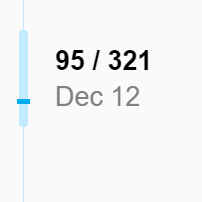
The guiding principle for when it appears seems to be whether there is enough room visually on the progress bar to have a gap between the handle and the button, regardless of how many posts the user has to scroll past to get back to their previous position. Observe:
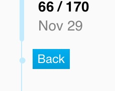
“Helpfully” letting me jump past one whole post to get back to the previous position in a short thread:
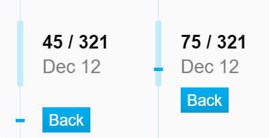
My latest-read position in this thread is post #3008. I can scroll up anywhere from 0-891 posts without having the back button or any indication of my read position appear…
…but scroll-up #892 summons it, and I can scroll to toggle back and forth between these states at will.
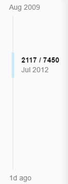
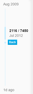
It also doesn’t work if you’re anywhere near the start or end of the thread (again by percentage rather than absolute post numbers). So if you’ve read 6,234 of 7,450 posts, it won’t appear no matter how much you scroll up, and the only way to get back to your last-read position is to scroll and pray or close and reopen the thread. The back button is a nice feature, but there are huge blind spots where it would be helpful but isn’t offered, apparently because a slightly cleaner aesthetic takes precedence over usability.
Okay, I may have gotten a bit carried away testing this out, but this sort of form-over-function thinking bugs me on a philosophical level. Figure out what functionality you want to offer, then make it as pretty as possible, not the other way around.
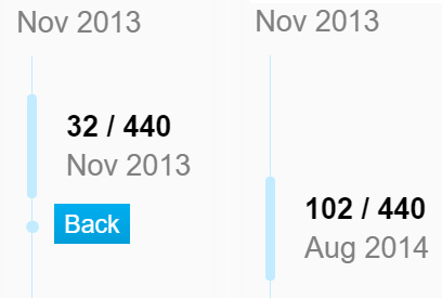
Not that I’m any kind of visual designer, but here’s 5 minutes of MSPaint work showing a user who has read all but 20 posts in a long thread, and then scrolls up another 20 posts from that position.
My thought would be to make the last-read-position marker a horizontal bar rather than a circle so it’s visually distinct from the scroll handle even when they’re touching or overlapping. That way you can just leave it there as a permanent anchor rather than making it phase in and out as you scroll.
Then you can enable the Back button as soon as they scroll ~5 posts or so. Personally I might try leaving a greyed-out ghost outline of the button next to the anchor permanently, since I think that’s a clearer visual language for “there’s a function here but it’s not applicable to the current state”, but I don’t feel as strongly about that.
It might be better to make it the darker color to make it clear. You’re right that a bar does have some advantages once we start superimposing, as circles are nightmarish to center. So maybe you’re right, we can always show last read point, then the only question is “do we have room to show a back button”?
Hmm, we could just offset it no matter what so it’s directly under:
Good point about the color. For those examples, though, wouldn’t the last-read marker always be at or below the bottom of the scroll bar? With the current implementation, you get back to the marker by aligning it to the bottom of the scroll bar, not the middle. The only way you’d see overlap in the middle as in your mockups would be when you’re actively dragging the scroll bar down past your reading position, in which case it will refresh as soon as you let go, right?
Yes, spot on. It should be a more or less instantly appearing link to get back to your previous position (or last read, I guess, depending on how you anchor it).
Well to be honest in the early days of the Discourse change-over I was instinctively trying that, and was surprised when it went back to the previous page rather than back to the last navigation link I clicked on. I guess I’ve been trained over the years by anchor links within pages!
But yeah there seems to be some disagreement around that so at least a software ‘back’ is needed for these instances. :)
I’m still trying to do it, hence my righteous indignation. :)
I’ve previously complained about the following behaviour, but given that this is the ‘back button’ thread I shall complain here as well:
I also instinctively press the back button when I get one of those lightbox things when you click an image. I’m semi-learnt to press the X button, but I don’t think I should have to (un)learn, I think Discourse should learn. Especially on a phone where the overlay takes up the entire screen and, as far as I can tell, it’s an entirely separate page. This site claims I’m not alone in this.
I also previously complained about this, but it’s been fixed:
The back button unticks boxes on the search page.
(Though in the process I learnt that the search functionality has gone from hating anything less than 3 characters to loving it and giving pretty terrible results for something like ‘a’)
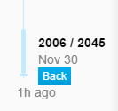
The initial version of this is finally deployed here. It is a little weird on shorter topics but works much better on longer ones. Also the button does not work on iPad. We’ll tweak that shortly but have a look and see, especially on the longer topics.
I apologize, I realized as we began to discuss this the back behavior we offered was essentially broken on any topic of size. Plus mobile offered no equivalent.