We shall consume each other, and finally reach consumana.
Sounds like a Shin Megami Tensei Plot.
There’s a big dip in several of those graphs around 2002. Is that the dot-com bubble bursting?
These graphs would be more meaningful if they weren’t from the real estate bubble era.
Every statistic is conveniently from 2006 or earlier - I’m betting there is a huge dip in every graph on that page once they get updated through 2010.
That seems like an odd magazine. This slidemakes me wonder about its message–is it an apocalyptic religious site? It’s hard to take it seriously when they spout this nonsense:
When a nation practices evil, there is no way that it is going to be blessed in the long run. The truth is that we have become a nation that is dripping with corruption and wickedness from the top to the bottom. Unless this fundamentally changes, not even the most perfect economic policies in the world are going to do us any good. In the end, you always reap what you sow. The day of reckoning for the U.S. economy is here and it is not going to be pleasant.
Also, I don’t think that image is from ID4.
There are few more advantageous times for the rich than in a downturn era. Trust me, they got the money and can buy up HUGE amounts of stuff for spare change at these times.
Its the working man who are taking the brunt of it.
Interesting thesis, and seems like it should be relatively easy to prove. If wealth disparities climb in the recovery after a severe aftermath, I’d say you are on to something. Links to demonstrate this?
Evidently, Kraaze didn’t read this part.
We’ve been discussing similar topics in this thread recently.
Bruce Judson believes that inequality did not decrease (probably leveled off) after the 2008 recession, because losses by the rich were offset by even greater losses by the poor and middle-class families.
I think this article indirectly shows you a little of my thinking, it could easily be extended to private entrepreneurs and business in general.
Parts you wanna read is what they did ‘during’ the marked crash.
Ah, right. I got you crossed up with someone else, and took you a little more literally than that. Carry on!
I understand your thinking, I just think your pet theory is easily disprovable.
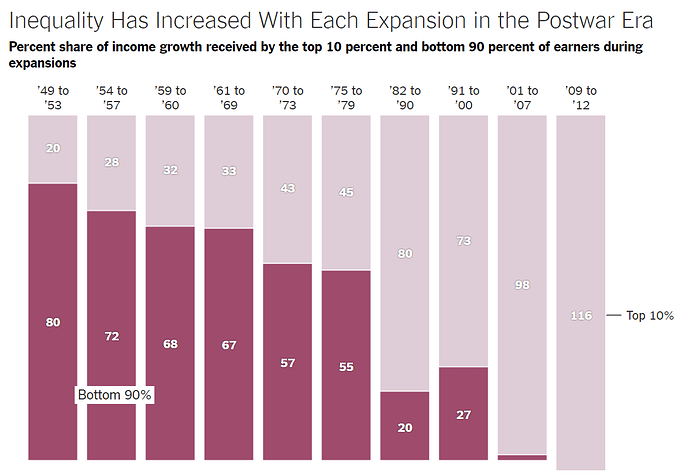
I think the chart backs me up well enough, sure, there are rich people who loose it all, but you gotta see the reasoning where SALE is always a good way to add stuff to your collection cheaply.
The graph looks broken, but it isn’t: from 2009 to 2012 the top 10 percent captured an impossible-seeming 116 percent of income gains.
And if you haven’t seen it already, this video is essential
Well, that is depressing.
Would be interested to see similar charts of the 19th century, because I feel that’s what we’re returning to.
The 19th century will have nothing on us. We’ll have the great poverty, the best poverty.
But we’ll also innovate the best, because low taxes mean innovation!
