Now that you guys have added the Patreon link in the header, can we get an Amazon support link too, please?
Why? Just posting a link in here converts it to an affiliate link, it’s all automatic.
edit: @clay for mobile, looks like z-index: 1038; is the magic number, 1039 is the editor. So that’s fixed.
Because I’m not going to post a link for everything I might want to buy and it’s easier than going to the front page.
It’s convenient for people wanting to fund the site. Why is that a problem?
Well, there’s a nascar-ification if everything we can think of is put in that prime real estate.

Up to Tom though. I suggest you post links to interesting / relevant / cool stuff on amazon anyway as an organic part of the discussion…
Fair enough, but as I said before when I made this request, make it a separate theme if you like, with that single addition. Then no one that doesn’t want it need see it.
Well, if only Discourse were advanced enough forum software to support themes, perhaps they would do so ;)
(Sorry, @wumpus, you’re just kinda fun to razz)
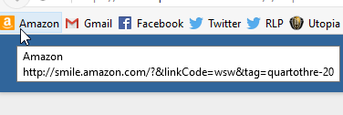
Aside from that, I can just recommend folks change their Amazon bookmark to http://smile.amazon.com/?&linkCode=wsw&tag=qt3-20 and click that when shopping. I can’t really visit the frontpage; the ads slow it to a crawl on my PC for some reason, and like you said, posting a link to anything you plan to buy isn’t really feasible, but using the bookmark above is really pretty clean.
Thanks. Free time to help has been hard to come by this week.
Patreon floating in the middle there, kind of looks odd to me. And I think its reasonable to wonder if Patreon is up there why not the other ways to support QT3. Space is an issue of course, it seems like it would be better to adopt the sort of solution that newrelic & how-to-geek have on their forums.
Tom said he did not care for stacked nav, so here we are.
Y’know I bet if the site used more of the horizontal width of the screen, crowding wouldn’t be such a concern ;)
(Sorry, I’m clearly in some kinda mood today)
What extra width? I don’t see any

Whereas I see a few hundred pixels’ worth on my “real” device. . . and hell, you’d have some were it not for that goofy twitter feed stuck to the edge like a wart :P
Anyway, point being that on desktop devices (since we’re already using icons/glyphs on mobile, I view that as a separate discussion anyway), there’s a ton of room hanging out up there. And all around. But also up there.
That just says to me “your zoom level is wrong” and/or “your window size is wrong”.
Well, I have no interest in using Patreon to support any site, but have gone out of my way to support this one via Amazon. Seems like making that easier would be a good thing. But whatever. Guess I’ll keep on keeping on.
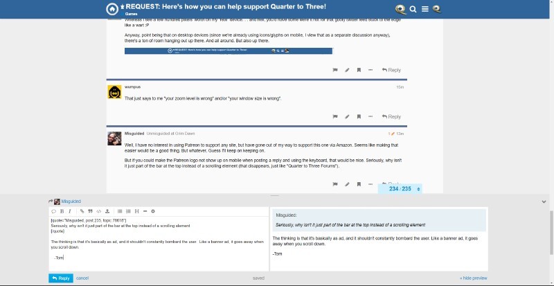
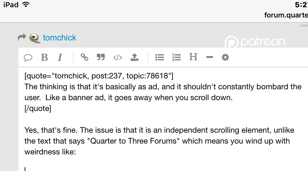
But if you could make the Patreon logo not show up on mobile when posting a reply and using the keyboard, that would be nice. Seriously, why isn’t it just part of the bar at the top instead of a scrolling element (that disappears, just like “Quarter to Three Forums”).
Again, ask yourself why advertisements scroll off the screen. I don’t know how to say it any more plainer than that.
(Also the z-order issue with the editor on mobile was fixed. Maybe clear your browser cache?)
The thinking is that it’s basically as ad, and it shouldn’t constantly bombard the user. Like a banner ad, it goes away when you scroll down.
And as for the width issue, here’s how it looks on my screen:
It seems odd that I have all this helpful extra width for the reply function, but the more commonly used read function is scrunched up.
-Tom
See the previous discussions about reading and line length, with the usability science and data cited. If you don’t like the side-by-side live preview, turn it off by clicking “hide preview” at the bottom right, and less width is required by the editor.
The point isn’t that I don’t like the preview. I like the preview. I like things that let me take advantage of my screen real estate the way I want to, and not the way you want me to. I honestly couldn’t care less about usability science and data cited, especially when someone uses it as leverage to tell me I’m wrong for preferring something a certain way.
But I’m not trying to rehash the argument, I’m agreeing with Armando that it feels weird to me that Discourse opts to waste so much space.
-Tom
Yes, that’s fine. The issue is that it is an independent scrolling element, unlike the text that says “Quarter to Three Forums” which means you wind up with weirdness like:
May I suggest taking advantage of your ability to size (and zoom) your windows exactly the way you want on your computer, as well? For example, on my three monitors, I can maximize this browser window across all three of them:

Or I can size it like this:
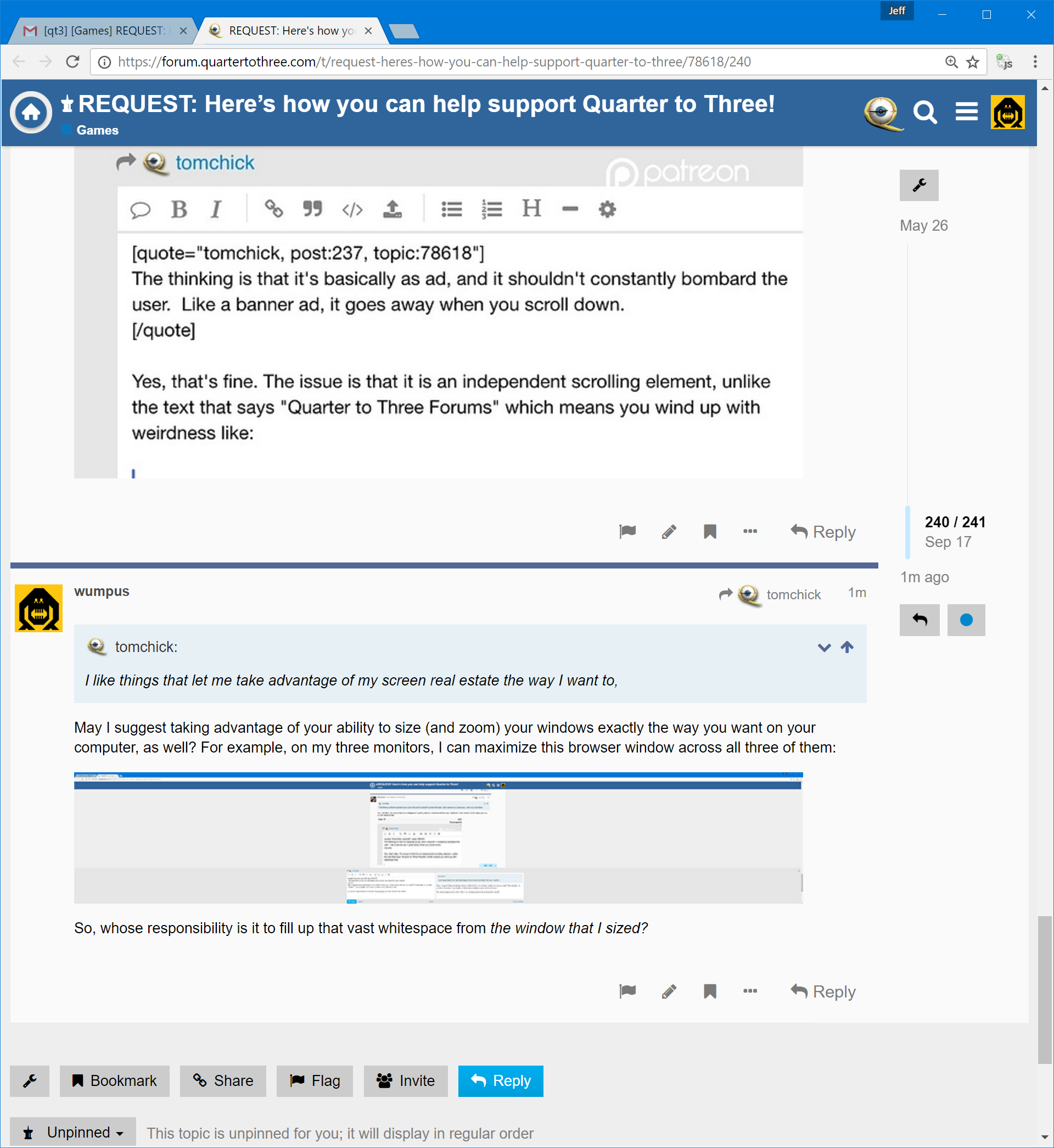
So, whose responsibility is it to fill up that vast whitespace from the window that I sized?