Just to follow up, yeah, the hideous header is gone. Thanks, whoever fixed it!
Awesome, thanks for the feedback!
I’m sure I could figure this out by trying it, but figured I’d ask, so it can act as a suggestion as well if the answer is no:
Is theming per-browser/session, or per-account? Because I’d love to run Dark on my phone and Default on my desktops :)
+1 for Solarized dark/light versions. If someone points me toward the CSS or whatever each theme uses, I can put in the grunt work of entering the color values and pass it along to @clay or someone for possible integration into the site.
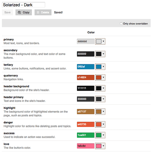
It’s not quite that straightforward, unfortunately. Here are the elements that have to be set. First of all, there are some base colors. I just named this one Solarized - Dark but the colors there are the defaults for the Dark Colors used in the default Dark Theme. We would need proper Solarized colors there.
This CSS specifies some additional color changes throughout (before the themes split CSS files purposefully). I need to pick it apart, at some point, but you’ll see where you can go through and make color adjustments.
Qt3 Light CSS Customizations - Desktop
/* lt. gray container around main content area */
#main {
    background-color: #EEE;
}

/* buttons are too light with the #eee background */
.btn {
    background: #ccc;
}

/* login button color tweak for consistency */
.btn-primary {
    background-image: linear-gradient(to bottom, #00AEEF, #009EDA);
}

/* top nav & admin button colors */
.nav-pills li>a:hover {
    color: #009EDA;
    background-color: #CADCEF;
    border-color: #BDBDBD;
}
.nav-pills li.active>a,
.nav-pills li>a.active {
    border-color: #16617d;
    background-color: #00AEEF;
    background-image: linear-gradient(to bottom, #00AEEF, #009EDA);
    box-shadow: inset 0 1px 0 rgba(255, 255, 255, 0.33);
}
.nav-pills li.active>a:hover,
.nav-pills li>a.active:hover {
    border-color: #16617d;
    background-color: #00AEEF;
    background-image: linear-gradient(to bottom, #00AEEF, #00B0F0);
    box-shadow: inset 0 1px 0 rgba(255, 255, 255, 0.33), inset 0 -1px 2px rgba(0, 0, 0, 0.2);
    color: white;
}

/* side nav button colors (profile pages, etc) */
.nav-stacked li.active a,
.nav-stacked li.active a:hover {
    background-color: #CADCEF;
    color: #333;
}
.nav-stacked .active .icon-chevron-right,
.nav-stacked .active:hover .icon-chevron-right {
    color: #333;
    background-color: transparent;
    text-shadow: none;
}
.nav-stacked li:hover .icon-chevron-right {
    color: #333;
}

/* topic list table styling */
#topic-list tbody tr:nth-child(even) {
    background-color: #F0F0F0;
}
#main #topic-list th {
    background-color: #E6E6E6;
}
#topic-list {
    border-color: #0000CC;
}

/* quote blocks */
.quote blockquote {
    font-style: italic;
    padding-left: 10px !important;
}
blockquote {
    border-left: none;
    background-color: #E7F0F5 !important;
}
.quote .title {
    background-color: #E7F0F5 !important;
}
aside.quote .title {
    border-left: none;
    color: #333;
}
.quote-controls,
.quote-controls .back:before,
.quote-controls .quote-other-topic:before {
    color: #536896;
}
.extra-info-wrapper .topic-link {
    color: #fff;
}
.extra-info-wrapper .badge-wrapper.bullet span.badge-category {
    color: #fff !important;
}
.d-header .icons .icon {
    color: #fff;
}
.extra-info-wrapper .topic-statuses .unpinned {
    color: #000;
}

/* SQUARE AVATARS */
img.avatar {
    border-radius: 0;
}


/* CODE BLOCK COLOR CHANGES */
pre code {
    border-left: 4px solid #ee3987;
    word-wrap: normal;
    overflow-x: auto;
    white-space: pre;
    background-color: #F9F9F9;
    max-height: none;
}

p code,
ul li code,
ol li code {
    background-color: #fff3cc;
    color: #000;
}

a.hashtag,
a.hashtag:visited,
a.hashtag:hover {
    color: #ee3987;
}

/* CLAYS ADDITIONAL ADJUSTMENTS */
.topic-body {
    background-color: #FAFAFA;
    border-top: 6px solid #536896;
    border-bottom: none;
    padding-bottom: 2px;
}
.topic-avatar {
    border-top: 6px solid #536896;
    width: auto;
}
.actions button.widget-button,
.actions button.widget-button.reply {
    color: #7A7A7A;
    opacity: none;
}

/* remove fading out of reply button */
.topic-body .actions .fade-out {
    opacity: 1 !important;
    transition: none !important;
}

.onscreen-post {
    background-color: #FAFAFA;
}

/* background gradient on categories */
tr.has-description.no-logo {
    background: linear-gradient(to bottom, white 70%, #eee 95%);
}
table.topic-list.categories .topic-list>tbody>tr:first-of-type {
    border-top: 2px solid #aaa;
}
table.topic-list.categories .topic-list>tbody>tr {
    border-bottom: 2px solid #aaa;
}
.topic-list.categories td.latest {
    vertical-align: top;
    padding: 0 4px 4px;
}
.topic-list.categories .featured-topic {
    margin: 3px 0 0;
}

/* the row highlight is broken when a background is specified */
tr.highlighted {
    background: linear-gradient(to bottom, #D5F1FB 70%, #BCE8F8 95%) !important;
}

/* Text color for category descriptions on the categories page. */
.topic-list td {
    color: #444;
}
a.mention,
a.mention-group {
    background: #c9e3ef;
}
table.categories tr.has-description {
    border-bottom: 1px #ccc solid;
    border-top: 1px #ccc solid;
    border-right: 1px #ccc solid;
}
table.topic-list tr.topic-list-item {
    border-top: 1px solid #ccc;
    border-bottom: 1px solid #ccc;
    transition: background .5s ease-in-out;
    background: linear-gradient(to bottom, white 70%, #eee 95%);
}
.topic-list a.title.visited:not(.badge-notification) {
    color: #666;
    font-weight: normal;
    font-size: 0.95em;
}
.topic-list a.title {
    color: #415888;
    font-weight: bold;
    font-size: 0.9em;
}
.topic-list.categories a.title {
    color: #415888;
}
.topic-list.categories .category h3 a[href] {
    color: #415888;
}

/* make sure last visit line is more visible */
tr.last-visit {
    border-bottom: 2px solid #f4bcae !important;
}


.quote aside .quote,
.quote aside .title,
.quote aside blockquote,
.quote aside .onebox,
.quote aside .onebox-result {
    border-left: 5px solid #D1E8F5;
}

/* timeline width and background color with soft edges */
.timeline-container .topic-timeline {
   width: auto;
   background: #fafafa;
   box-shadow: 0 0 8px 10px #fafafa;
   border-radius: 6px;
}

/* Trying to make the embedded posts look better. */
.topic-body:first-of-type {
    border-left: 6px solid #536896;
}

/* Upside down "unpinned" pin needs to be white */
.extra-info-wrapper .topic-statuses .unpinned {
    color: #fff;
}

.private-message-glyph {
    color: rgb(230,86,44);
}

/* Fixes for small messages that appear sometimes between posts */

.gap {
    width:auto;
}

.gap.jagged-border {
    margin-bottom:0;
    background-image: linear-gradient(135deg, #fafafa 50%, rgba(255,255,255,0) 50%),linear-gradient(-135deg, #fafafa 50%, rgba(255,255,255,0) 50%),linear-gradient(45deg, #fafafa 50%, rgba(255,255,255,0) 50%),linear-gradient(-45deg, #fafafa 50%, rgba(255,255,255,0) 50%);
    background-color: #eee;
    border-left: 1px solid #eee;
}

.small-action {
    max-width: 100%;
    border-top: 1px solid #e9e9e9;
    border-bottom: 1px solid #e9e9e9;
    margin: 4px 0 4px 0;
}

body {
    background-color: #eee;
}

/* hide the show full post button */
button.btn.expand-post
{
    display: none;
}
So basically, we’d need the values therein updated to be Solarized friendly. FWIW, we also need them to be Dark Theme friendly. I haven’t had time to tweak those, but the defaults are alright. If you want me to set up a Solarized theme, then provide the values replacing those in the image at the top and then provide a CSS code snippet copying the one in this post, but replacing the colors with Solarized colors. Make sense?
p.s. That CSS can/should be cleaned up. It was sort of ad hoc created when we moved to Discourse. FWIW, it’s combined with other CSS elements that don’t specify colors at all but change site width, etc. If you want to, you could pluck the colors out of the code above so that we can separate the structural CSS from the color CSS, which will make it a lot easier to create additional themes.
Sweet, I’ll poke around in there after I do some actual looking-for-paying-work work here.
@Nesrie and @Pod: I built a greyfolio theme for you, it is selectable now. It doesn’t have @clay’s CSS enhancements, but I used an old screenshot and a color picker so the colors should be dead-on. Enjoy!
Thank you!
I also built a midnight blue theme-- check it out. I’m not 100% happy with it, but I’m using it for now.
Edit: And Solarized (Dark) too. This one works really well.
And now Solarized Light is in there too. I don’t have much love for Solarized Light myself, but maybe someone out there wants it.
@rei: That is a common bug, try changing your theme and then changing it back.
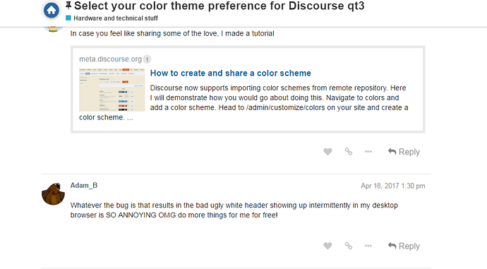
In case you feel like sharing some of the love, I made a tutorial
Whatever the bug is that results in the bad ugly white header showing up intermittently in my desktop browser is SO ANNOYING OMG do more things for me for free!
Also added Tomorrow (Night), a higher-contrast dark theme that isn’t intended to be extremely easy on the eyes like Solarized, but the tradeoff is it’s a bit easier to read.
It seems to me like it’s simply an issue where we need to refresh and reload the styles after someone has saved changes to the CSS. And people have been updating it throughout the day.
If that’s right, the issue will simply disappear once the styles settle down.
Wendelius
Yeah, I’ve been messing around with it lately. Bug in Discourse with the new theming code, as I haven’t touched bright, dark, greyfolio, or blues in well over an hour.
Any way you’d consider taking the time for Tomorrow (Night [Bright])? I’m curious to try out the pure black background on my phone.
If it’s too much trouble, completely understood. It’s a bit of a niche request :)

