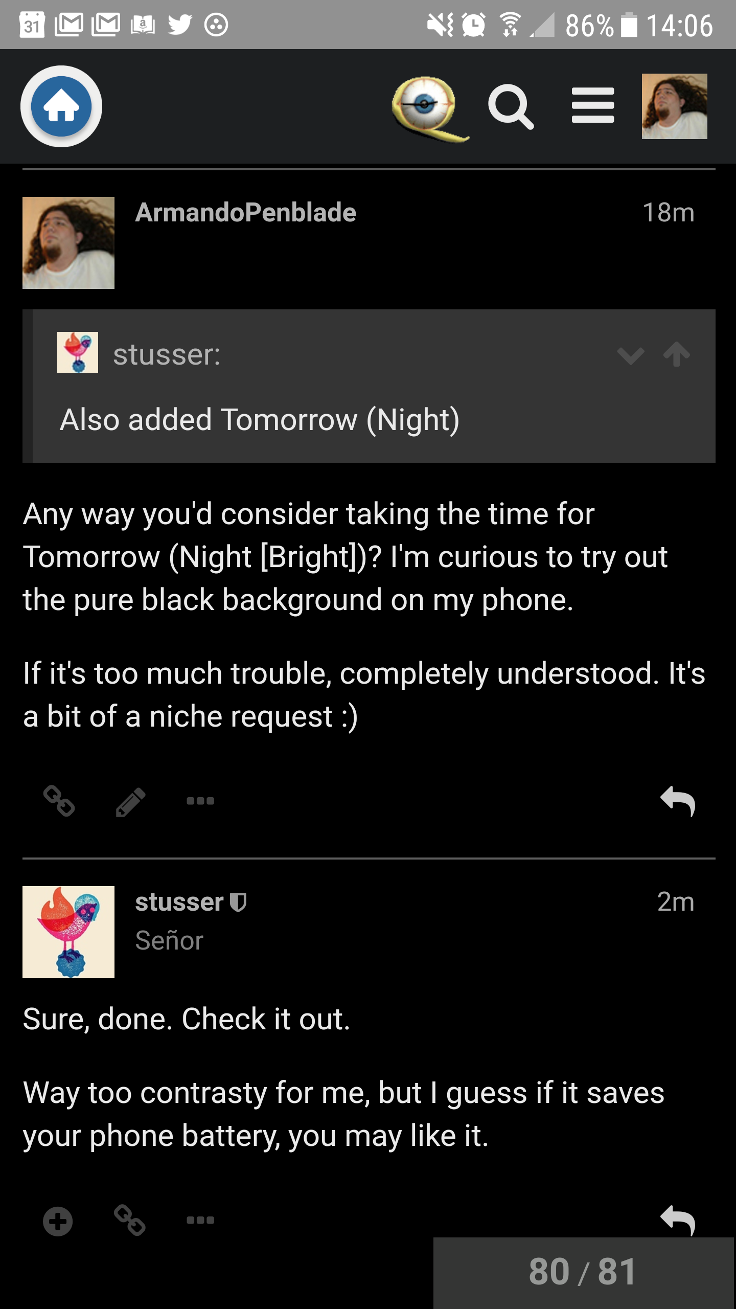
Sure, done. Check it out.
Way too contrasty for me, but I guess if it saves your phone battery, you may like it.
Sure, done. Check it out.
Way too contrasty for me, but I guess if it saves your phone battery, you may like it.
The faint lines around posts/boxes look a little odd in Solarized Lightt:
I recognize that this stuff might still be getting heavily tweaked, but if that’s not intended, figured I’d at least note it.
I can’t fix that without getting into the CSS. Same deal as the oddly bright blue text in the forum summaries and the weird grey box when posting in my beloved midnight blue theme.
Once we get all the base themes in, we’ll do a poll to see how many people are using each one and use that to convince @clay to consider putting in the time to fix stuff like that.
I’m happy to fix the stuff but I need to break out the color rules from the size/style stuff and then it will be easier. I probably won’t be able to spend time with it until later in the week, though.
It’s all good, baby. No stress.
Well, @stusser got busy and clearly I can close out my test discourse instance. Damn near everything is here already.
Would love to tweak the css a bit though. :)
If you have any tweaks, send them over. I’m not doing any real CSS customizations (beyond square avatars and plus-sign likes), just colors.
I realize it’s still a WIP but Solarize dark as-is, is a revelation. Thanks, guys!
I’m using it now as well. I think it looks good. What changes would you want to make?
The best part about losing my style is opening up the drop down and seeing all these other ones when I apply it again. I am still loving grey though.
Thank you.
The color of In-line links in solarized dark needs to be differentiated a bit from standard text color. Random link…
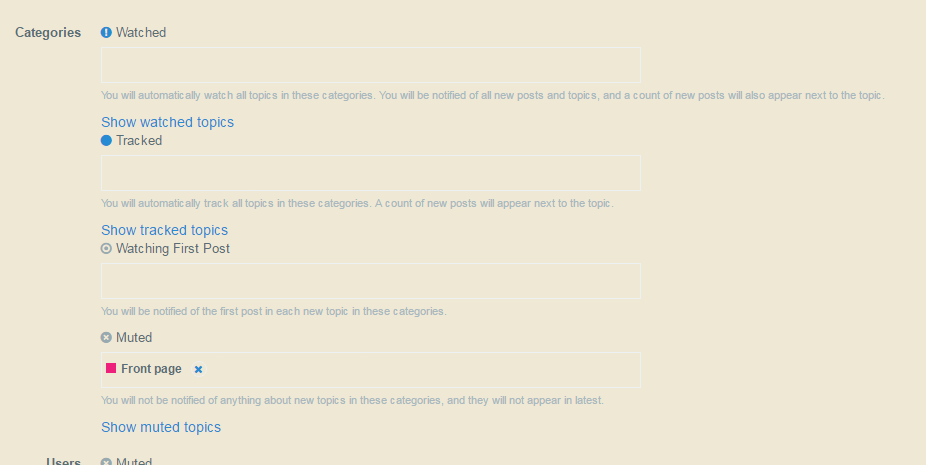
Once the custom CSS elements are broken out of individual themes, would it be possible to allow custom themes based on the admin panel coloring seen here?
I wouldn’t personally use it but seems handy.
That is definitely a problem. I have links set to a different color already, so that’s a bug in the discourse theme code. It will require CSS to fix. Or a patch to Discourse of course.
I could create a theme based on those colors but they are not Solarized Dark hues. Eyeballing it, that looks like the standard dark mode. My guess is someone cloned “dark colors” to solarized dark before I filled in the real colors earlier today.
Sorry, might not have been clear. I’m not looking for that specific color scheme, but the ability to have a “custom” scheme that’s my own personal coloring, driven by a menu like the one linked. So if I’m really feeling a hot pink and lime green combo one day I can change my settings and not bug the admins with my dumb request.
Update; I believe @clay tried to hack together Solarized Dark colors before we had theme support in Discourse. I removed his CSS and now links look OK in Solarized Dark. Note these colors are not exactly what they were before; his CSS overrode many of the color settings I put in.
Clay, in case you wanted that CSS I put it up here.
@LockerK: No, Discourse doesn’t allow for user-definable color schemes, only admins and site-wide.
Greyfolio oddly still seems ‘bright’, but I’ll trust your ability to use the eyedropper :) It could benefit from a little more contrast though - ie., dark divider lines between comments and maybe darker on the quoted text background. But regardless, much appreciated for bringing it back! Like others have said, QT3 has always been Greyfolio in my mind, since I first begged for it way back when and you were nice enough to oblige :)
Solarized Dark is so very very close to wonderful, but the wheat color used for text seems a bit too bright as well. Who’s crotchety?