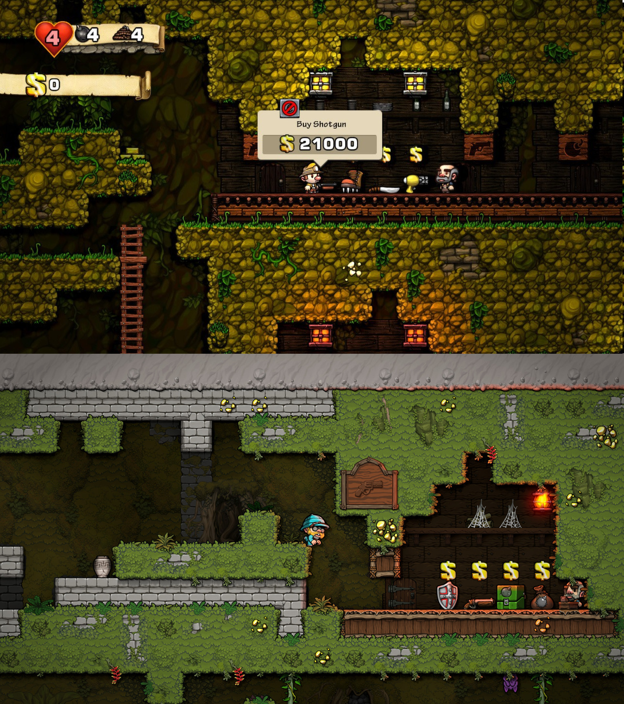
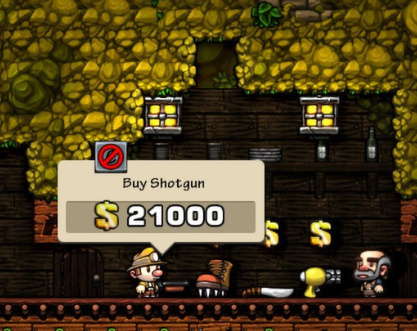
I like the Spelunky 2 design more. I’m having a hard time articulating why, but in comparing the jungle shots specifically, it’s much clearer in the second shot what exactly everything is. The first shot feels very noisy in comparison.
It definitely feels more like function over form, and I can understand why that repels some people. But having read Derek Yu’s book about the first game, I think it matches the way he conceptualizes Spelunky in his mind.
That may be the case, but having played the game for thousands of hours, I’ve never had such an issue arise. So from my perspective, it’s just a graphics downgrade. And btw this is not just me saying so – they’ve gotten this feedback from many Spelunky players. It does seem like they worked on improving their lighting engine in response, and specifically the dark stages seem improved. It may be that I’ll get used to it, assuming the game is really good and I’ll play it as much, but the difference is quite glaring to me.
Well, thank you for the concern, but I’m simply referring to the (already, then) suprise launch on Xbox 360 as a download only title of the remake of the first game — and the couple of years it took for the game to be released on all the other platforms afterwards.
Nothing esoteric, really!
Mostly it’s just a different style. They’re going for a more plain, elegant, desaturated style, and less for one that pops out and captures your attention. I’m not a fan of the style, but it seems like they added a lot of complexity to the mechanics, and I’m interested in that.
Here is a better image that doesn’t have video/YouTube compression off the Steam store page, and an image similar to yours (but not overly saturated like the on you picked - this is also off the Steam page):
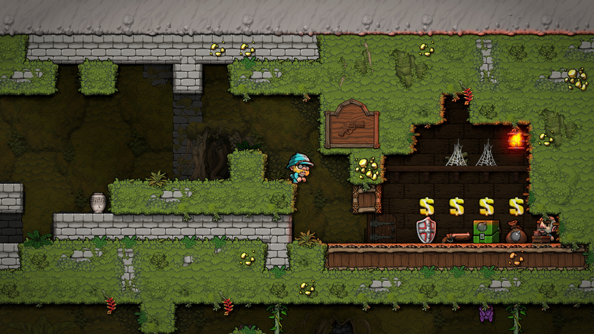
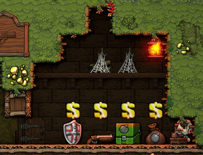
I love Spelunky’s look, and I always will. But I really do appreciate the clean, sleek look of this new one. I love the individual art assets better, such as the shop items, the shop keeper and the player model, the vase, and the more even light (but you see a nice light reflection from the shopkeeper’s lantern, which is subtle but perfect). The backdrop looks a lot more detailed and interesting to me in the new game, as well.
Here is the full image, since no one is like to play this in 720p:
There is more contrast in the original game’s textures, more darks and lights, which I think is what you mean to say when you say “flat” but that doesn’t make it better, just more nostolgic as a style you probably grew to love (and perhaps you’ll grow to love S2’s style as well, you never know, wait until it’s in front of you, is my advice). It may be that you prefer the higher contrast colors in the first shot, but to me now after seeing what the sequel looks like, they seem too busy and less focused. I’d rather the action be in and around the animated sprites, and not the textures in the walls as much. The game has plenty going on moment-to-moment, I think it will be a better game for having a cleaner look to it.
I don’t think it’s that. I think Spelunky really has some of the best 2D art in gaming, and I thought that from the first minute I saw it. Just to show that it’s not nostalgia, I always thought the Spelunky HD music was below average and generic, and didn’t match the quality of the original Spelunky.
Spelunky 2’s art style looks like it was made by an artist who’s very good at drawing, but not so much at painting. The details are there, but they’re not accompanied by a richness of color, and most of the color is fairly bland. It’s a style that is just not as attractive to me, in the same way that I find the art style of Renowned Explorers unattractive, and that will be the case after even 1000 hours.
I’m hoping that’s not going to matter. Just as I tolerate Spelunky HD’s mediocre music, I hope the gameplay makes up for Spelunky 2’s mediocre (from my POV) graphics.
I really think this is more an aesthetic preference than any failing on the artists part, it sounds like. I see what you are getting at, but it’s too subjective to say “it’s because the artist isn’t good at an aspect of creation” when it seems clearly “I vastly prefer one style over the other”. Nothing wrong with that, but you shouldn’t be blaming your not liking something on the art team, imo.
Why are you listening to the music? Just turn it off! :) I never listen to music in almost any game past some hour mark that’s arbitrary and based on if I like the music. Sometimes I turn it back on to re-appreciate, but generally music stays off (generally as I like to have Netflix or something streaming on the other display while I play).
I really like the Spelunky 2 art a lot. I didn’t hate the original game’s style. I did think it was a bit too busy at times, making it hard to discern active stuff from the environmental details. The new look makes the active sprites a lot easier to pick out to me.
That’s a good point – I often don’t listen to music since I’m netflix playing, but some game music is genuinely good: Slay The Spire and FTL, for example. Spelunky HD is one of those tracks that is like… well it’s like elevator music. You tend to forget it’s even there, and it adds very little to the atmosphere IMO.
Maybe the clear graphics and bright lighting is to go for that modern (?) game design approach where they give you all the information you need and challenge you to figure it out. Like Into the Breach or similar games.
I’m a big fan of how the lighting cast by sources of light works in the new game. For example, in OG Spelunky light seems to spread out through the rocks/terrain:
But in S2 it actually looks like it reflects off walls and objects, like the floor or the items for sale.
I couldn’t say what was wrong to me from the start — it just looked bland — and you perfectly describe it.
It’s sort of what happened between Rick Dangerous and its sequel, back then. “Hey, let’s put more detail - oops we forgot about that lighting thing”.
Interesting to read how they frame a game with such extreme difficulty. I especially liked Eurogamer’s framing that falling off a skateboard in your 40s is an event that has tremendous meaning in your life. That you’ll remember that fall. I’m guessing because you’ll likely break something too.
Out on PS4! Only shows up in the store on the console so far. Played a couple levels, died lots. Controls don’t feel quite the same so need to get used to it.