How much battery need this forum? Is sending receiving information from the network all the time? or is more passive and allow the network to go “down” to save battery? Is this a real concern or a dumb one?
Your screen is going to use the vast majority of the power drained while on the forum
In general, the only thing I open in Chrome on my phone is Qt3, because the mobile web sucks shit and interacting with websites on a 5" screen is dumb. I really miss Tapatalk a lot, though Discourse’s mobile interface is at least better than vBulletin’s was.
Anyway, digression. Point is, Qt3 is 99% of my Chrome usage on my phone. On an average day, Chrome accounts for about 10% of my battery usage over the course of the ~3 hours of screen time my aging battery can manage.
One might argue that’s very low or very high. In general, the only app that might use more than Chrome is Facebook or possibly Boggle, a game I play with several local friends to kill time and sometimes zone out into. Otherwise, Chrome is the top app each day, meaning that Qt3 in general uses more battery than any other non-component use of my phone (e.g., background network usage, screen on time itself).
Chrome is also currently up to 714MB usage since the 1st of this month. Again, noting that, to the extent possible, I do not open other websites in Chrome unless I need to, say, briefly check a recipe while in the middle of cooking. Last month I wound up with 754MB of Chrome usage, same deal, so I think you could argue that Qt3 is consuming 5-600MB/mo at least, on top of ~10% of my battery each day.
Now, I’m on Qt3 a lot. I’ll let you call how “bad” or “good” that is :)
yea, but that 10% of CPU power, my concern is about a ajax call activating the radio antenna, forcing it to be active when could be off
But do Android battery statistics include only cpu usage or also radios?
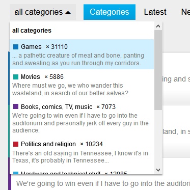
Apologies if this already was covered above or in some other thread, but the change in the “all categories” dropdown is fresh, isn’t it? Is it really necessary to have the description text in there rather than just the forum name? I use this menu rather frequently, and now that I have to scroll down within that menu to reach lower three sub-forums. Went from two user actions up to three. It’s a minor thing, but it really doesn’t make sense to have the forum descriptions in that menu.
Any reason you can’t use the hamburger on the right? It’s generally more compact. Alternately the descriptions can be hidden with CSS.
I surely can use it, but in terms of usability it’s worse because it happens to be on the part of the screen where my mouse cursor usually is not when browsing the forum or any sub-forum - it’s on the left side.
Integrating the descriptions doesn’t really make much sense since anyone who’s used the forum for an hour or so knows what the sub-categories are for - and it’s not like the descriptions here are actually helpful and make it more accessible.
EDIT: To clarify it - it’s not really the descriptions I’m finding annoying here. It’s the point that the dropdown menu now doesn’t stretch long enough to have all sub-categories visible without the need to scroll within the dropdown.
The other option is local CSS or themed CSS that makes it taller.
I wanted to add my grievance I hate the new dropdown. HATE. Get rid of the descriptions.
Agreed. It’s how I’ve been navigating since we migrated, I don’t really even understand what the new look provides, why change it?
If one of you guys or possibly @Clay can come up with CSS to change it, I’d be happy to add that to all the various themes. I find myself using the Latest view, but I used to view by category on VBulletin.
Why was this changed in the first place? It’s really bugging me because i now have to scroll before i can select the last two.
Horrible, painful ui design.
Of it can be changed, it can be changed back.
I should be able to hide it easily. I’ll take a look later tonight.
This should be fixed now on all themes. Let me know if you see any problems.
That’s nicer. Aren’t the numbers just clutter though? And All should have a capital :/
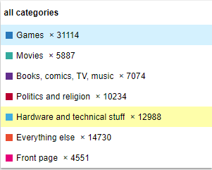
I’m pretty sure the Numbers are out of my control. The English localization file probably sets the “all” text.
The numbers can be hidden by targetting them in CSS, too!