15 hours to go on the Kickstarter, for anyone who still wanted to get in on it.
This reminds me, back in the Old Country I’d promised @Major_Malphunktion some more specific feedback on the SSR demo than “Eh” or whatever monosyllabic grunt I’d used. So here goes, bearing in mind that yes, I know it’s just a pre-alpha demo and literally everything is subject to change…
LIKES
- That it exists
- Mouselook
- The sound design
- The door animations
- Falling damage
- The extrapolation of the original textures and models into high-res/high-poly (with a couple of exceptions)
- Being able to see the station from the windows
DISLIKES
- The Unity title screen isn’t FPS capped so it runs at several thousand FPS, causing the most insistent whine from my video card
- The spherical, Portal-esque security cameras, as nice as they are, look very out of place next to all the faithfully updated models
- The energy recharge station use animation looks like something out of Crank, with the zapping and arcing all over the place. This makes it seem like the recharge station is malfunctioning, not working as designed.
- The unskippable item pickup “gawk” animations that prevent you from doing anything else until they’re done are so. goddamn. annoying. For the love of god, please let players turn these off.
- The new Rebecca Lansing email gets a triple-dislike:
- The plot change-- in the original, TriOp knows exactly who you are and what you’ve done, which provides an excellent sense of the hacker being utterly screwed and motivation to do exactly as he’s told. In the new email, you’re just some random guy she managed to get ahold of. Booo.
- The tone and language of the new email is far too flippant for someone who’s supposedly an official TriOp employee trying to save a multi-billion-dollar space station.
- Even the voice acting is off. Original Rebecca simply sounds like someone who’s doing her job and very serious about it. New Rebecca sounds like a saucy late-night DJ.
- The Sparq Beam firing effects, while very pretty, are way over the top for how powerful it actually is. They barely leave any visual headroom for the actually powerful late-game beam weapons.
- Having to click keypad and puzzle buttons in-world. I’m guessing this was done because it seemed immersive, but it actually has the opposite effect because it’s so awkward, even with a mouse. Lord help anyone trying to manage this with a gamepad.
- Clicking buttons to activate doors and medbeds. In original SS you just clicked the door or medbed to activate. Now you have to focus on a button. This is a usability step backward. SS2 got this right by making unlocked doors simply open automatically when approached. SSR gets it wrong.
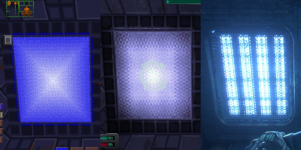
- Those fluorescent lighting panels. Pretty abstract in the original. SS2 updated this texture in its Where Am I? level to look like fluorescent lighting diffusers, which made sense and looked nice. SSR seems like it had the same idea in mind, but along the way forgot what diffusers actually look like and ended up with something that looks more like industrial lighting, not commercial lighting. I mean geeze, look at that. Can you imagine actually working in an environment full of those things? You’d go mad.
- The delay before item descriptions appear. In SS you got a description just by clicking. In SS2 they improved this to not even require a click-- anything with a description displays it immediately. SSR went with the worst solution-- stand and stare at something for a second to see if anything appears (which often it does not).
- The randomized use messages. This makes no sense in the game fiction, where all onscreen text is supposedly provided by your implant. Worse, it’s immersion-breaking, because it encourages players to repeatedly click on things to see what all has been written for it, which is thoroughly meta-game behavior.
- The way onscreen text s.l.o.w.l.y. appears one character at a time. Please, this is so very 90’s Hollywood-OS. Even original SS knew not to do this.
- Inventory interface covers entire screen. One of the unique things about SS is that it always keeps you in the game, no matter what you’re doing. SS2 followed its lead, keeping the interface grid tucked out of the way at the top. SSR gets this wrong. You completely lose sight of the game world while in the inventory.
- The violin music when you approach that first window. No, SSR, just no. You are not Bioshock. Citadel is not Rapture. Just stop. No.
- Ladder climbing. When not on a ladder and you press forward, you move the way you’re facing. But when on a ladder, suddenly the forward and back keys become hard-wired to up and down, instead of making you climb in the direction you’re facing. So if you walk forward onto the top of a ladder and continue holding forward… you immediately back right off of it. Not good.
- Can’t jump onto/off of or fire weapons while on ladders.
- When you get close to a bright light source, an effect appears on the screen as if you’re looking at the light through dusty plexiglass. This makes no sense. The hacker is not wearing a helmet.
- Overuse of shiny shaders. After all the flack Doom 3 got for making everything excessively shiny you’d think devs would have learned, but here we are again. The medbot in particular looks like it’s slathered in bioluminescent glitter gel.
- The way your character bobs up and down while standing still. No. Humans do not stand that way.
- Excessive use of pointless messages telling you things like item picked up, switch flipped, etc. You don’t have to tell me what I just did, game. I know I did it, I was there.
- The orange strobe lights don’t actually cast any light.
- In the options menu, the Back button should be labeled Cancel, which is what it actually does. Took me a while to figure out why my control changes were getting ignored.
- Destructible lights. A neat idea, but makes it way too easy for players to “ruin” an area for the entire rest of the game by knocking out most of the light.
- Compass takes up entirely too much vertical screen space. It could very easily be tucked into the empty space between the left and right overlays.
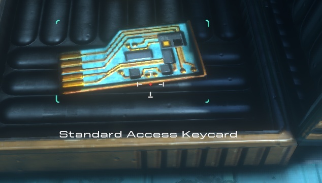
- This is not a keycard. This is a circuit card. Come on, even the Fallout games take themselves more seriously than this.
- The hallway wall textures. While they do look like what the original low-res wall textures could have looked like, in SS those textures are described as “soft paneling”, which makes sense since this is the medical deck. SSR, on the other hand, extrapolated these textures into very deep, very sharp-edged protrusions that wouldn’t look out of place in the engine room of the Event Horizon.
So overall, this is troubling. Inasmuch as one can interpret the alpha demo as a peek into the minds of the developers, it seems to me that the direction so far is prioritizing “cool” and “cinematic” over logic and usability. If this was just some random FPS I wouldn’t care, but SS is the granddaddy of immersive sims, so it has to take itself more seriously than this or it won’t work.