Yes I’ll definitely get a X2+ next year, if they offer such a thing.
It is comparable in size technically but being extra tall doesn’t afford much extra usable space in practice. Hell the keyboard right now in mobile safari is not even using all the space:
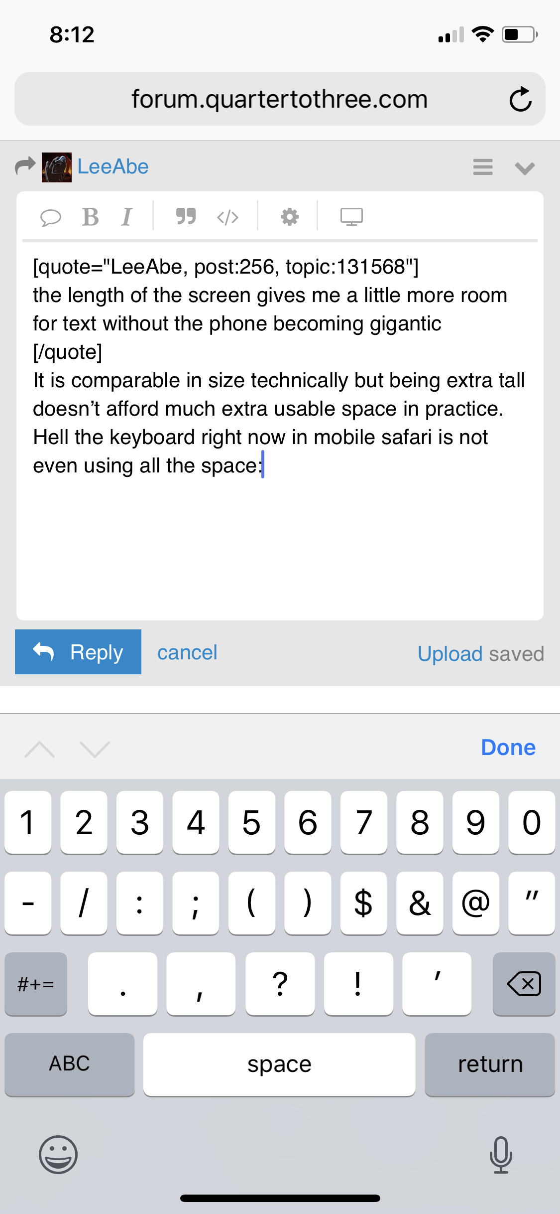
Click to expand, note the vast gray area at bottom.
Yes, that was done for usability purposes; supposedly the keyboard being stuck so close to the edge of the device made it difficult to use. No other phones have this problem because the X is the only device available in the market without a bottom bezel. And even if an Android phone without a bottom bezel existed, it would still have the navigation bar below the keyboard.
I don’t think I like that gray space below the keyboard. It looks ugly. It will be better if the keyboard is made to look as if it floats, with the app visible underneath, where the gray space is. Or, even better, let user drags and place where they like the keyboard to be.
That’s another option, but notice they moved the microphone and keyboard switch buttons down there, which were cramped in previous iPhone keyboards.
You wouldn’t be able to use the small amount of space below the keyboard for anything meaningful, so I have no major objection to blacking it out. I trust their usability studies on this one because it feels plausible.
The length gives you more text on the screen, but it’s more LINES of text. Which doesn’t do a thing for usability compared to more WIDTH of text, which lets you read more before your eyes move to the next line. People don’t tend to read web pages and other scrollable text views like Pocket from top to bottom and then scroll; they read the batch of lines in the middle and then scroll up. So the vertical height does nothing in that case. It only helps in page-flipping style apps like the Kindle app.
That said, I went from the 7 Plus to the X and haven’t really found it any less comfortable to use, except in websites with small text. Qt3 went from a little small to uncomfortably so on the X; luckily @stusser did with a theme what Wumpus would not with variable text and created a larger text solution.
The extra space at the bottom of the keyboard looks bad in a static screen shot, but when you’re actually holding and typing on the thing, it makes perfect sense.
This is absolutely untrue, the text size is 100% identical on the X and the iPhone 6/7/8 plus. Zero change because it was always 15px. Matches iMessage default text size on both devices. Feel free to look up the screenshots I posted in the relevant topic.
The iPhone X screen isn’t as wide as the Plus, and it’s 458 ppi vs 401 ppi. The X is a 375 point display, the Plus is 414.
But I guess my eyes are lying to me when I find it not as easy to read at default size.
Let’s see. Here’s a screenshot of a Discourse post I took on the iPhone 8 plus.
Now here is the same post on the iPhone X.

Let’s put the first line from that post right next to each other and see what happens. iPhone 8 plus on the top, iPhone X on the bottom.

Yep, looks 100% identical, just like I said it was.
Also notice the width difference, you get “the same” sized screen as the plus, technically, but only in terms of more visible text / posts underneath. Long phone is long.
Instead of screenshot, can you please take a photo of the two phones showing the same page side by side? My 21" monitor and 32" TV both have 1900x1080 resolution. I think if I take screenshot of both, they would look the same. But standing in front of both and seeing the two physically from outside is VERY different.
Per @habibi ppi is irrelevant, they use the extra res to render better looking fonts, not smaller ones. Otherwise we’d all be looking at impossibly tiny text on 4k monitors.
This is Apple, man. They’re religious about this stuff. You think iOS fonts in iMessage are going to render at different sizes on different devices? That’s crack pipe talk. I use default iMessage font as the gold standard of what default text is supposed to look like on an iOS device, and that’s what I compared on both devices. I overlaid Discourse post body text, with the iMessage summary text, which is most equivalent in my book.
I see what you’re getting at, but I dunno:
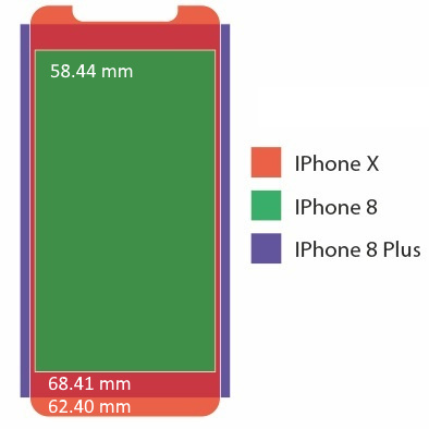
68.41 mm / 62.40 mm = 9.6% larger width for the plus. (Interestingly the X is “only” 7% wider than a vanilla iPhone 8)
So let me approximate that. This is the iPhone 8 plus screenshot, resized to 600px width.
This is the iPhone X screenshot, resized to 547px width, which is exactly the proportional difference in width between the X and the 8 plus. A little less than 10% narrower in width.
Here are the two first lines, from the above images, next to each other.

I don’t have a X. But I put my iPad Air 2 and iPhone 6 Plus side by side, looking at this topic (at the same Dynamic Font size), and they look identical. I wish I have a 3rd device to take a photo to show it. Maybe later when I am home and can use the missus’ phone (*) Physically the iPad screen is bigger and yet the font seems to scale to match, which is REALLY nice.
Btw, this is a good reference site for iOS resolution.
Edit: for science
Left is iPad Air 2, right is iPhone 6 Plus. The text are the same in both devices.

The only exception to this I have found is on iPad Pro (giant size, but possibly on regular size as well), where docking panels on the right definitely changes the actual font size / proportions of the rendered website on the left.
It may be against Internet rules, but I’ll admit that I must have been wrong. The smaller screen gave me the perception that the UI and text were smaller as well. At any rate, thanks to CSS magic, I’m happy. :-)
If you want to see the font size actually change, try docking stuff to the right hand panel of an iPad with the website on the left panel, at various panel sizes. I can 100% confirm that happens.
My X finally came today. Briefly:
- I don’t love the form factor but probably won’t return it for an 8+. Hoping for an X2+ next year.
- FaceID works flawlessly and I don’t miss touchID a bit. Tap and raise to wake work great, no need to use the side button ever.
- The new gestures are a huge improvement and I don’t miss the home button one bit. Particularly great for multitasking is the swipe left/right on the bottom.
- I really wish they’d let us disable the little horizontal bar at the bottom. It’s unnecessary, I got the phone an hour ago and I think I can remember how it works.
- Similarly, I don’t want to swipe up to unlock. I don’t want to see the lock screen ever.
- Surprised so many marquee apps still aren’t updated for the X. Google Maps isn’t updated!?
- Stereo speakers sound dramatically better than my 6s. Much louder too.
- The apple leather case for the X has much better buttons than on my 6s+. I think I recall them fixing this with the 7 though.
- As for speed, it doesn’t feel appreciably faster than my 6s+. I mean maybe it’s a bit snappier, but the difference isn’t sufficiently large for me to be sure that isn’t choice-supportive bias.
Yep, it makes using my iPad difficult now, I have to remind myself to use the button.
I agree with you, but the best we can hope for is an option for this in a future iOS update. Apple is too in love with their new notifications that only reveal when faceID unlocks the phone to force everyone to go straight to their home screen on unlock.
I just switched to Waze because of this. It was updated yesterday.
Just visit Speedometer 1.0 and put those feels to an actual test. But if you never, ever browse the web then … maybe? It is true that the 7 was already balls fast, but 6s isn’t that fast. I went from an iPhone 8 plus to the X so I get 0% perf “improvement” 😁
Yeah this XXXTRA SUPER MEGA XXTREME tall thing is… not great. My only substantive complaint. Would prefer a more proportional device. Everything else (screen, faceid) is 💋
Also pretty sure iOS 12 will add a “suppress the annoying footer hint bar” option, so I wouldn’t worry about that. Apple is kinda right, removing the home button after ten (!) years is a big change and they want a big ass hint for a while.
Obviously it benches ridiculously faster. That’s why I said it doesn’t feel appreciably faster.