On my 6s with iOS 11, here are the two areas I feel are degraded heavily compared to iOS 10:
“Hey siri” takes a few seconds longer to comply, even for a simple request like setting a timer. (it took my 6s a full six seconds to set a timer earlier today.)
The widgets screen takes a while to load, and stutters excessively while scrolling.
Would an 8 or X fix these issues? Or do I need to wait for 11.2?
I don’t use hey Siri normally, so I just turned it on and it seems snappy enough. Widgets have always been fast for me, and they’re perfectly snappy on the X also.
Honestly the biggest revelations for me have been the vastly improved speakers and leather case and the gestures.
Siri was as slow as you describe, if not slower, after I updated my iPhone 6+ to iOS 11. The iPhone X is instantaneous. It makes using Siri to control my lights a real pleasure.
@wumpus - minor discourse thing. I had to add back in the emphasis on feel when I quoted it. It seems like you’d want that to survive a quote since emphasis can very much change the meaning of something.
Those render differently to me. Emphasis is an important part of a conversation, otherwise it wouldn’t be an option to begin with. To me it is weird to quote someone and strip their emphasis away. I don’t really feel like that is fair of me and in a more nuanced conversation meaning is lost if someone reads my quote and response.
Yeah, I’ve noticed the same thing on my 6s after updating.
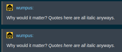
And I agree with @Lantz that emphasis should be preserved in quotes. That’s part of the meaning of the sentence, and shouldn’t be thrown out. The theme I’m using doesn’t italicize quotes, but even if it did, I would prefer if the emphasized section stood out in some way, even if it was to reverse the normal pattern and make it non-italic when the rest of the quote is italic, like so (leaving this out of quote tags so the formatting survives.):
Obviously it benches ridiculously faster. That’s why I said it doesn’t feel appreciably faster.
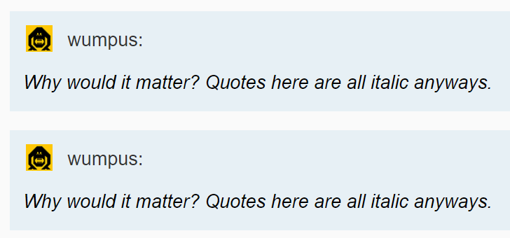
See my screenshot. Zero difference in the default theme, so I dunno what fucked up stuff you guys are getting to in alternate themes. The qt3 style is for quotes to be all italic, so… dealwithit.gif
Meh, I think I would stand by my point that quoting stripping emphasis is a negative. When you quote something with italics that has something in it that is in italics itself, it is pretty standard to invert them so the italics part is now now in italics.
I read Mother Go recently, It was pretty disappointing YA stuff despite being labeled as hard sci fi.
I read Mother Go recently, It was pretty disappointing YA stuff despite being labeled as hard sci fi.
That’s an error in the theme, and should be fixed by editing the theme… if @stusser wants to make it so the default theme does not italicize quotes, I will recognize this as a valid issue and not one god damn nanosecond sooner.
This is a truly impressive degree of defensiveness over a request for an innocuous usability tweak.
This isn’t about italics per se and fixating on the default theme is irrelevant – that’s just a symptom of the root cause, which is that clicking ‘Quote’ only grabs the plaintext of the highlighted section, without any of the formatting. Note that it also strips out the special font on your dealwithit.gif, and the bolding and bullets below:
So… since the qt3 default theme doesn’t automatically bold all quotes, can we instead please get a fix for bold formatting getting stripped out of quotes?
(since I’m pretty sure any sensible fix there would have a side effect of fixing italics for us godless heathens who have the temerity to deviate from the one true theme).
All this shit is wildly off topic anyway. Take it somewhere that someone who cares can look at it.
For the record, I don’t think quotes should be italics by default, and it is a bad theme default. For your suffering to stop, you need to care about stopping everyone’s default suffering. If you don’t, if you’re all about gettin’ yours, then I got no time for you, pal.
I dunno about that… heavy-handed enforcement of a rigid UI paradigm, refusal to countenance individual user preferences, sneering at anyone who dares question it… seems right at home in an Apple thread.
But I’ll make a request through the proper channels instead if that will make you happy.
ProTip: If you think the default theme is bad, you don’t have to keep using it! Just click on your avatar in the upper-right, and go to the Interface menu to see all the options. I know this sounds too good to be true, but whoever made this forum software was a pretty smart cookie, and realized that people might have different preferences.
This is a pretty basic example of separation of concerns. The core Discourse software quote interface operates at the data level, and themes customize views of that data.
All we’re asking is that you stop arbitrarily discarding a portion of the post data when quoting – if themes mangle it beyond all recognition later, that’s on the theme. If Tom and Stusser want to override the font style and make all quotes italicized (or 56-point bold comic sans with every letter a different color, for that matter) by default, that’s their prerogative. Customizable themes are the correct way to adjust and account for your own preferences.
Big words from a dude who’s too butthurt that Tom overrode the default theme here to even consider changes to benefit every user of his company’s software.
I’m considering it, just not when the literal example is “this italic thing can’t be double italicized”, because that’s idiotic. If you don’t like that, be the change you wish to see in the world, or I dunno, take up another more useful hobby or something.