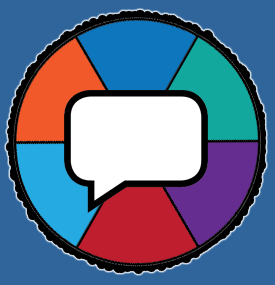
I still think there should be a talk bubble of some kind. A stranger visiting might not know what the heck that pie arrow thing is. :p
It should be a logo that makes no actual sense, but looks like it does make sense so that people spend a lot of time trying to figure the deeper meaning where there is none.
So? Like a forum topic colored Tapir riding an upward arrow rocket? :D
For what it’s worth, I don’t think that the logo needs any kind of arrow on it. In an ideal world, there would be two different Qt3 representations and we would use one for the forum logo. IMHO, it’s not a bad idea to leave the eyeball there and use a simple home icon or something for the link to return to the front page. However, Tom said he wants the eyeball to link to the front page. While it might not be the loveliest or most fitting metaphor, most internet users are aware, by now, that a home icon means to return to a homepage of sorts.
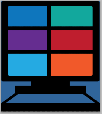
It should be a desk with a computer screen, with the 6 colored blocks on the screen.
Because, let’s face facts here. This is what we do when we can’t sit down and play a game.
FTFY.
Are we voting? I vote for this one.
It’s a lie I tell myself.
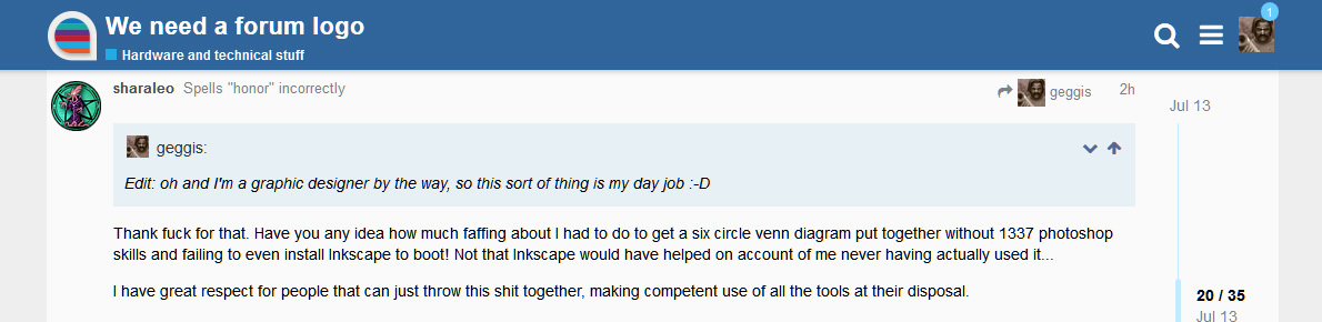
@sharaleo I like this one a lot. No arrow up, nor tapir though… :p
I also just realized there are only 5 colors, 1 of which repeats!
Get your eyesight or monitor checked, sir! I colour dropped those bastards right from the category page! :)
For reference there are three shades of blue in that. The pie colours match the categories, the background matches the header, which is a different blue again.
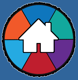
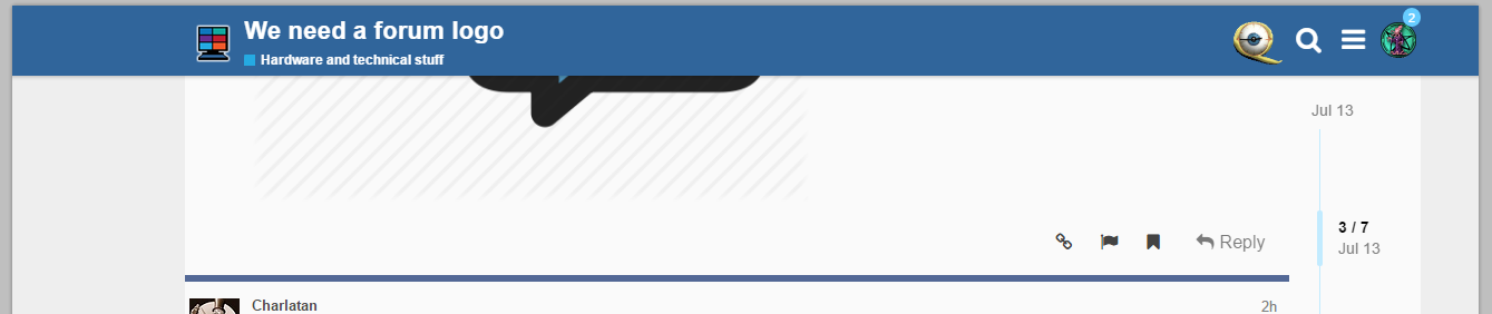
Ok, a bit more serious suggestion this time. How about something like this? Or with a speech-bubble or keyboard or whatever instead of a house?


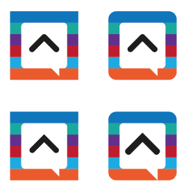
I really like the idea of pulling the colours in from the categories so I started with those. I also like the idea of having a speech bubble in there somewhere, possibly with a home symbol or chevron or something inside. I figured just throw everything together and see what happens:
Which, in situ, just doesn’t look that nice! It needed a white outline to make that top blue stripe stand off…
The speech bubble looked too square as well, and then it struck me: a Q looks a bit like a speech bubble. So I did a bit more messing and came up with this which I’m really happy with (best viewed fullscreen/enlarged):
It’s a little abstract but I think that kind of works in its favour. Too many Q’s would look a bit daft. It uses the Discourse grey and a faint drop shadow under the colours to tie it into the forum look. Thoughts and suggestions welcome!
Okay, I’m going to go and play some games before bed! :-)
Edit: oh and I didn’t think the forum landing page needed another full blown Quarter to Three Forum logo incorporating the text, mostly because when you get to a thread the text melts away leaving just the icon on the left there.
Oh man, I really like the Q as dialog box thing, @geggis! I take back every mean thought I’ve ever had about graphic designers!
I like this! Can we use the Q23 colors, e.g. yellow of text and white and blue of eyeball, rather than the category colors? The category colors weren’t really “native” to q23 so they feel a bit random to me.
@geggis knocking it out of the park! The Q version looks particularly slick.
The rainbow gives a bit of a “gay pride” feel, not that there’s anything wrong with that, I’m a woke dude y’all, but it’s not the central identity of the forum. I agree that incorporating the colors in the original eye (blue, yellow, white, and a smidge of red) would probably work better.
Not to mention it just looks like we’re a LGBT community now.
Edit: stusser beat me to it
Edit 2: Always be positive, don’t just criticize. So, forgot to mention that I lurv the rest of it. The Q used that way is really good!