I prefer the Latest view also.
ProTip: If you mute the P&R category, it won’t show up.
Remember the first post is a wiki-- if you have a suggestion add it!
I prefer the Latest view also.
ProTip: If you mute the P&R category, it won’t show up.
Remember the first post is a wiki-- if you have a suggestion add it!
They will make more sense once you have more active conversations going on, as they are prioritized there. On day zero with no replies active, it will seem a little odd. But yeah, pulling conversations from 10 years ago is terrible, we’re going to add a cap there for sure.
I’m going to work on getting transparency on this favicon so it looks good on the mobile. That’s my to do once I’m back from Sunday errands.
We can look at tweaking the mobile font size. Does Ctrl + not work on desktop to make it larger?
Please, please, please give us a nightmode like the old forum had. QT3 is too damn white and bright for me to handle at night!
Yeah, using it on mobile is really hammering this home for me. I never did much w/ the darker Qt3 themes on desktop, but I used Tapatalk’s dark mode, alongside the Twilight app on my phone (which dims and reddens the screen to encourage natural, uhhh, sleepiness response, from the body). Unfortunately, mobile Chrome overrides the changed display settings from Twilight, so while a Chrome tab is open on my phone at night, the screen brightens and, erm, blue-ens significantly. Combined with the bright white theme that differs from Taptalk’s old one. . .
Might be the case that Qt3 will now literally keep me up till a quarter to three on the regular thanks to it basically being a flashlight in my face at night!
I’m generally visiting Qt3 on an iPad, so there’s no way to do a Ctrl+. Zooming does work fine on desktop with Ctrl+.
I think probably the best solution would be for Wumpus to add a font-size to Discourse preferences, since I can’t be the only one in Discourse’s user base with this issue (and in fact dgallina said he had the same problem minutes after my post). But I realize it’s probably non-trivial for him to add.
At minimum if the software didn’t lock out the iOS pinch-zoom capability we’d be able to have at least some control over the font-size on our own. But currently both the mobile view and the desktop view seem to prevent the browser from zooming in. I’m not sure if that’s a discourse thing or something in the CSS, although a quick Google search suggests that it’s most commonly done with a meta tag setting viewport in the HTML. An improved style sheet or a user-preference setting is preferred though as pinch zooming generally means part of the document isn’t visible (using our old software I’d taken to pinch zooming in on the post texts but not being able to see user names without some scrolling).
Are the styles and CSS or whatever its called in yet - The forum looks horrible right now. Way too bright, text way too small, and it only takes up 1/4 of my screenspace.
The baseline CSS is in-place now, mostly based off the work that Clay, Brian R, and others did on the original testbed forum.
They’re still implementing tweaks and changes–along with wumpus’s help (and again, others I’m sure I’m not mentioning), of course, but I think it’s fair to say that the rough form of the forum is in-place now.
What’s the glow around certain avatars mean? Online? It doesn’t seem to correspond w/ admins or threads w/ new posts…
When topic owner is last reply.
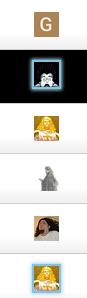
I’ve PMed stusser with a Qt3 favicon that’s also transparent, hopefully the icon on the iOS homepage will not have that ugly black borders, as shown on the screenshot above.
So as a stopgap until this forum properly implements themes, the Chrome plug-in “Dark Reader” works well. Gives you a black background, gray borders, and blue highlights/headers.
It’s hard to locate this thread if you are not consciously aware that it’s in Hardware. All other forum related threads are in Everything Else or Games. This is the only one in Hardware.
On desktop browsers (I assume since you mention screenspace) any ordinary page zoom (Ctrl +) should work fine to enlarge the text. The forum software will reflow text and rearrange control icons to accommodate the larger text size.
Thanks for the fix, stusser!
Have you tried the bookmark feature?
Also, I think icon transparency shows as black on the iOS desktop. You’d be better off making the background blue or something.
Thanks, Clay. Sometimes I forget about the Bookmark feature.
A dark theme, especially something like Solarized colours (linked in the initial wiki post) is my top request. All the browser theming in the world doesn’t help me on mobile Safari.
Nice to see that a dark theme is already on the agenda. White tends to blast my eyeballs from my head. I don’t want to look like the qt3 icon.