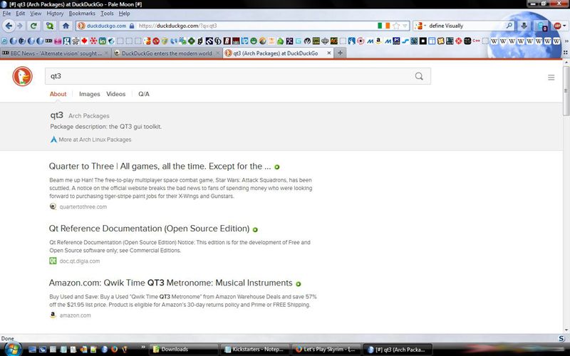
That don’t look ugly to my eyes, but I am not trained for graphic look, I can only comment on ugly code.
Thanks for that Starlight. I was cursing i didn’t have screens from the old duckduckgo to compare etc, but that is helpful :) Now is that the old version of duckduckgo or the new? For sure google is much more functional, with the various category tabs etc, so i think that is the old duckduckgo, but strangely enough i think it looks better than google or the new one, which shifts things to the left, leaving more white space, but does add some category tabs like google. It’s a subtle thing, a really small aesthetic thing, but i recognize it each time i use it.
But as i’ve been saying i’m less worried about the new duckduckgo look (just prefer the old, it would be awesome to have the new category tabs and the old formatting/style!) compared to the general trend for all apps/software post Windows 8. However the new duckduckgo does ‘stick’ for me on first search, but only when i use the little browser bar at the top of my browser window. If i go to the actual duckduckgo webpage and search the ‘sticking’ thing does not happen. That did not happen with the old duckduckgo.
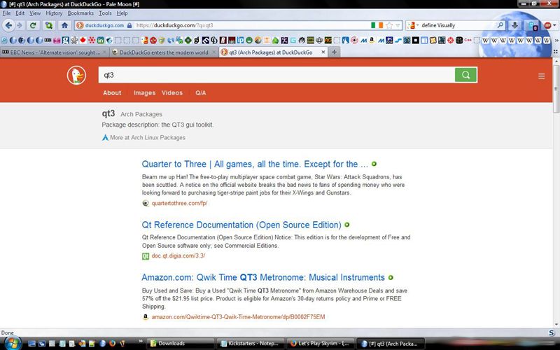
And to help compare the look change, here are the screens from the new Duckduckgo, both ‘default’ (which looks like google more), and ‘retro’ which is pretty much the same, just a red colour and more central placed search results. So not much like the older look imho. Not bad, but like i said i’d much prefer a meld of the old style and formatting as shown by Starlight’s pic with the new catergory tabs of the new version. But really this is a tiny issue, and not one to make me rage quite on Duckduckgo!
New default look:
New Retro look: (which i use, but not sure if worth it now!)
edit: Removed, “technical jargon” per demand.
I got to do a lot more scrolling as i have less space for search results compared to the old version.
Why it look odd? can you make a screenshot?
edit: Removed, “technical jargon” per demand.
He asks you for a screenshot and you start spewing technical jargon. Is alt-printscreen too hard for you?
Removed by DEMAND FOR SCREENSHOT BECAUSE I AM THE WORLD
Starlight, I simply don’t understand your penchant for editing out old posts.
The main reason that fonts look weird in my (limited) experience would be aliasing (usually scaling an image much larger or smaller than it was intended), or kerning (spacing between letters) getting broken. I suppose the actual letterforms could get distorted, too, like one stroke could become thinner than intended relative to the rest of the letter because they aren’t scaling appropriately.
Removed by DEMAND FOR SCREENSHOT BECAUSE I AM THE WORLD
Would that be the world view that asks for you to post a screenshot so we can see what you’re talking about?
No, your worldview that you’d rather make arrant demands, which utterly kills any desire to help you, than have a technical discussion about the issue. Because I can’t get a decent screen grab while I’m running a render, because of a really odd driver bug which causes pattens on the screenshot (or, it might be the first sign of my GPU dying).
All gone, per your demand, since I don’t have a screenshot this very second. With a wordy, time-wasting explanation, so you can waste your time reading it, since you could NOT wait another…20 minutes. Right.
So, I guess I’m curious. Do you behave like this in real life, and if so, how often do you get punched in the nose?
I don’t know that I’ve ever encountered anyone who comes across as so thoroughly unlikeable who I agree with so often as you, Starlight. I really feel like if you made some minor modifications to how you interact with others, you could be a perfectly wonderful person! As it is, it really shouldn’t come as a surprise that everyone is a cock to you, as they’re merely responding in kind!
Uh…You’re replying to Warning. (You walked into that one, right. It’s called sarcasm, once more)
Anyway, feel free to go find your own sources for screenshots for high-DPI displays and hinting issues if it’s so critically important to you.
SUCH CLEVER WOW
The post editing is especially pointless when the original content remains as a subsequent quote. It’s very much “If I can’t see you, you can’t see me” and makes absolutely no sense beyond petulance. Do you rip up speeding tickets in front of cops too?
No, I don’t follow your practices, but thanks for talking about them to the forum, Mike!
You couldn’t wait to attack me, I had to give you the screenshot then and there. Never mind you were not the person replied to, never mind I’d have done it later on if you hadn’t come in and made another attack on me.
I assume by your behavior you’d have gone over the screenshot with a fine tooth comb, called me out for using the “wrong” font or some such nonsense…then you whine when I don’t chose to play along.
Armando - Yes, you are. Scream it to the hills!
It’s gotten to the point in the last couple of weeks that I really have no idea what Starlight is going on about half the time, especially in being so obnoxiously combative recently.
Here we have another thread that has just gone to shit because he wants to start an argument over some imagined slight and make everything about him. It’s hard not to see him as a narcissistic sociopath at the moment.
No, it’s very easy to treat other people as Human and engage with them. I disagree with, say, Stusser all the time but there’s no abuse thrown even when I’ve been snarky about his views on SSD companies. Look, no, I didn’t provide a screenshot then and there. Could have been a few reasons for that, and I did in fact explain (to a torrent of further abuse). Why would I leave people targets? Why would I be /less/ snarky when people are being rude?
It’s a flipping screenshot (yes, that’s absolutely what it’s about), so “narcissistic sociopath”. Really?
I’d prefer to talk about font types, etc…so sorry that’s not on!

