Hey, when did the forum front page change to this? I like it!
Yeah, I just noticed that, too. It’s really nice! I like it a lot!
They just updated it today for Discourse in general (not just here). I… don’t love it right now, but I see where it’s going and I like the potential.
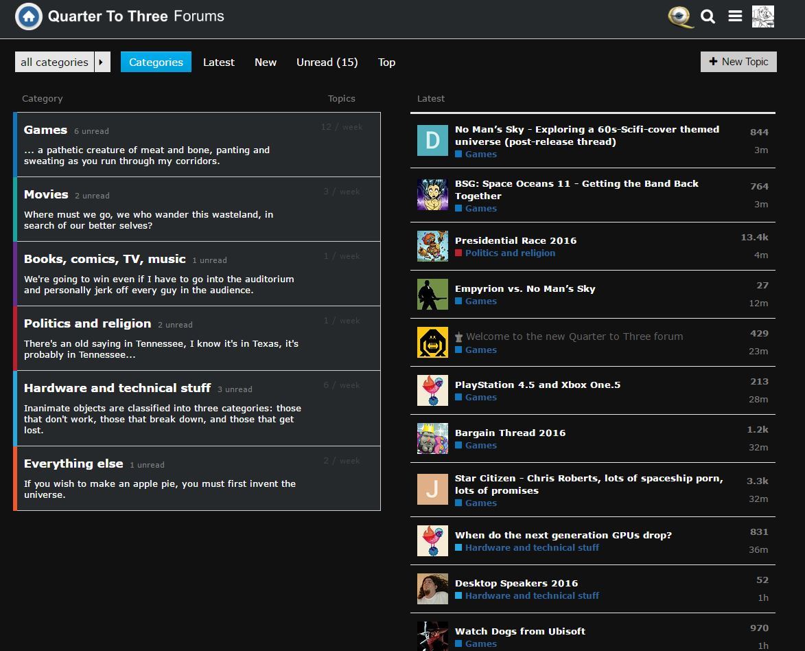
(Okay, it actually really visually bugs me right now to have a bunch of random topics and giant avatars taking up so much of the page, and the asymmetry of the actual columns. But I get the why behind it, and if it’s refined a bit I think it could be a pretty cool update on the “traditional” categories page.)
Couldn’t put my finger on it but yea, not a fan because of this – it makes the page really unbalanced and puts a big emphasis on avatars which have generally been pushed into the background here.
I just generally don’t care about recent threads at the category level at all and don’t want that information presented to me there.
@clay feel free to restyle the right column to match the left. Right now they may be a bit discordant since the right column is new.
The main thinking is, it was increasingly nonsensical to list three topics per category, even if that particular category was last updated 3 months ago. It is also hard to read a list that is segregated arbitrarily by category. So the two columns are more independent now: one is for category navigation, the other is a simple list of recent topics independent of category.
I think this is a good change as it lets categories concentrate on its job, navigation, and it frees up the right column to simply list recent topics. The whole thing is clearer with two independent halves rather than one awkwardly stitched together whole.
count me in as one who liked this view as well … would be EVEN better if clicking on Games on the left window, will show the Latest-Games in the right; and clicking Movies will show Latest-Movies.
I thinks it’s a terrible change. If I want recent topics, I’ll go to Latest. I go from category to category, I don’t want a jumbled mush of randomness.
I disagree. This page will be very useful for new comers. If you are already a frequent member, you will already go direct to the Latest. You will hardly ever need to go to the main page anyway.
No. I am a frequent user and never go to Latest. Don’t lecture me on how I use the forum. There is a Categories page and a Latest page. Keep it that way.
Just want to say I like the new forums front page. On desktop it always feel like the right side of the old page is just taking up dead space.
If it were a little better balanced, visually, and the styles matched more, I think I could contentedly ignore it en route to going to Latest myself. As-is, it looks a little wonky, but I understand that’s because it’s a new feature that hasn’t been skinned and tweaked to fit our personal style yet.
I think there is a lot of wasted space on this board, but the change would be fine if it would just stop sometimes not loading at random. Sometimes I just have half of an already half of my screen space just sitting there with a round circle cycling round and round trying to load the latest topics.
And amen to that. The work of Clay et. all has, I think, upped the information-density of Discourse, but it’s still extremely. . . empty to this day. Le sigh.
Senseless change.
I like it. It’s marginally more useful than what was there before and looks better too.
The Dude cannot abide this change
Ug. I hate the change. It’s much harder to spot updates to the topics that I care about. As others have mentioned, there was already a “latest” page, if I wanted to indiscriminately browse all that is new.
I also dislike this change- completely unneeded.
If this one isn’t reverted I might leave- it’s that bad.
Holy moses -I come back to see if black theme has been implemented, and this is how the forum looks now? Cluttered, icons everywhere and now this incredible bad looking front of the forum as well?
Whats next - likes and dislikes?
Yeah, I think this is it for me as well.