Game graphics that give you warm and fuzzy feeling

This right here, this is a graphical concept that will still give me a little thrill every time I open up the map and see it:

No, not this game specifically. I’ve never even played Kingdom Come: Deliverance. What I love is an empty, or at least fogged out, game map. If I’m given a world I can explore and a map I can fill in, I know there’s automatically going to be something I’m going to love about that game, even if there’s nothing else. After all these years, this will always give me a warm and fuzzy feeling.

Well now, that’s just not fair to these other games.

OMG yes yes yes. Still my favorite out of all their games.

The original Monkey Island 2: LeChuck’s Revenge graphics. Lots of great screenshots to see here:

It was like stepping into a series of rich, beautifully rendered illustrations. Every new screen was its own reward. And this after opening the box covered in Steve Purcell’s incredible artwork and using the piracy wheel.

For something more modern and not so rooted in nostalgia, it’s Proteus for me.


Likewise the soundtrack is pure nostalgic comfort too. There aren’t many games I’ve been playing for 16 years straight.

Wonderful thread!
Sometimes I’m looking for games that give you just that feeling. Right now Surviving Mars and TW: Warhammer 2 are doing it quite well. Looking at them makes me feel the way you described.

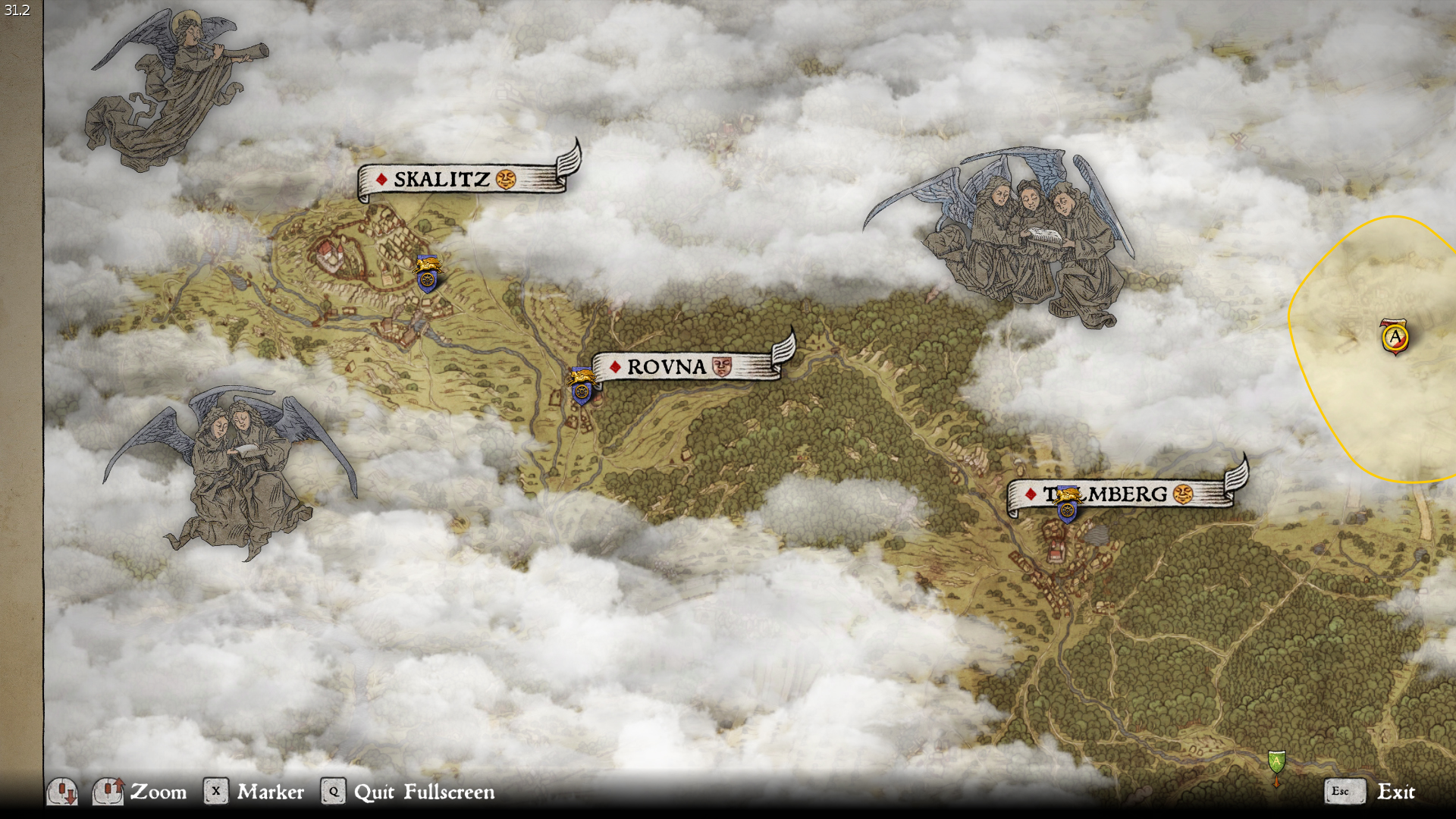
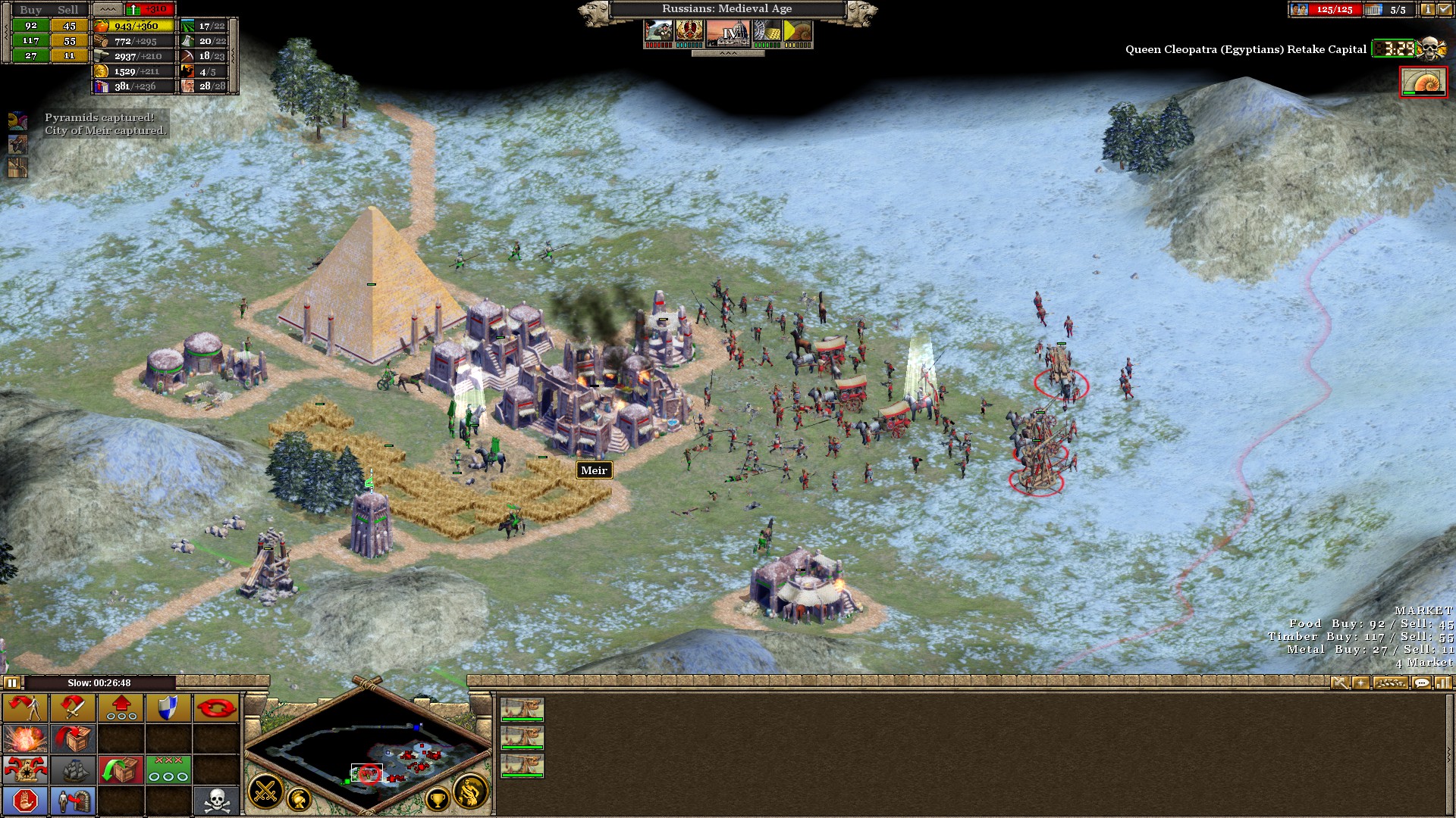
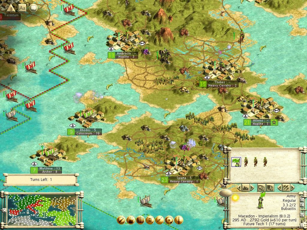
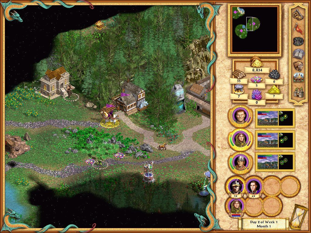
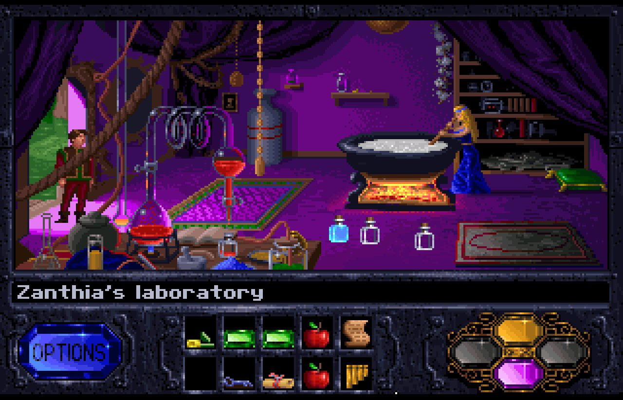
Ni No Kuni II, Sekiro, Dark Souls, Bioshock, World of Warcraft, Baldur’s Gate, Icewind Dale, Planescape: Torment, Elex, Anno 1404 & 1800, Operencia, Commandos, Shadow Tactics, Total War: Warhammer, Age of Empires 2, Hegemony 3, Starcraft 1 & 2, Sins of a Solar Empire, Kingdom Rush, Warhammer 40K: Dawn of War, Battle Chasers: Nightwar, Invisible Inc., Sang Froid, Lords of the Fallen, Apex Legends, Call of Duty: Black Ops ? (the last one that had the very warm colored Blackout map), Prey, Quake, Spellforce 3, Victor Vran, Darksiders, Settlers 7

I see a pattern here: Comic vibe (of which I’m not a fan actually. . .) with warm colors - I’m disappointed by myself : ) Or snow! Snow is very important. Others, that have not enough room on the list, are mostly hand-drawn or 2D/2,5D games. I skipped most nostalgia stuff although Quake might fit into that category. There are lots more.

And there are some games that just look too good to trigger that feeling. Mostly indie games that are very much aware of how good looking /stylized they are. That’s somehow not getting to me.

Heck yeah! HoMM2 virtual high five!

Heh. The look and feel of Alpha Centauri is the main reason I was never able to get into it. I wish I could, I just… all that red, it never felt right. I always quit after about 10 turns.

You chose a nice screenshot though. I had no idea the game eventually ended up looking nice. (Since I never made it that far).

The Civ series, specifically Civ 2, but especially Civ 3. I haven’t played the series since then, but Civ 4 didn’t have the right look, and neither did Alpha Centauri. Civ 5 did though! Still, Civ 3 is my favorite in their look that gave me the fuzzies.

Just look at that color they have for the sea and the shoreline. Mmmmmm, love it so much!

Edit: This thread will make me re-install Civ 3 and HoMM2.

There’s something about that era:

  • resolution was expanding, so you had UIs and in-game art tailored for 1280x1024, which was significantly more detailed than the previous 800x600 ceiling (remember when Lord of Destruction uprezzed Diablo II to 800x600? Good times!)
  • assets were often being generated in 3d but rendered (and i believe exported out) in 2d
  • storage had gotten cheap with universal HDDs and CD-ROMs to install from
  • lighting was generally nonexistent, or so static as to belie the term

Heroes IV, as much as it was incomplete and inarguably shitty in many ways, is a great example of the look. Age of Empires, Civ 3, all kinds of stuff from that era.

Shoot it in my veeeeiiiiinnnns.

Play Morgan and clear that red stuff away! No, I understand; it’s garish, alien-looking and menacing in-game, but to me, that just makes the cities feel more like cozy frontier homes.

In addition there are elements on the map that give me frisson, like the blue and green bonus minerals, for some reason, and the shorelines. Even the dialog boxes felt “right” despite a sci-fi aesthetic that could easily have been cold. I was very fond of the tech tree poster, too, on the wall behind the monitor. :)

If that’s your thing you’ve GOT to check out Frostpunk. It has beautiful graphics, but a dark undertone.

Ugh, gorgeous. 1404 is never getting uninstalled.

Yeah, despite how Heroes 4 turned out as a game, it was gorgeous. It was a return to the great look from Heroes 2. Not sure why they went so wrong with the look of Heroes 3.

Very fond memories of this one. It was so colorful!

I love this thread. Please keep posting screenshots, everyone!

Everquest with the original character models. Especially true when it comes to the animation. I also love the many different zones and moods of EQ.


Me too! People are smarter than me, as it never even occurred to me to post or ask for screenshots.
Not sure if this has any impact on anyone else, but I love the map and diplomacy screens in ES2.

Some good old fashion Quest of Glory!