Has anyone braved painting up Twilight Imperium? Was it worth it?
They will - heck, I haven’t painted minis in almost 20 years, and I still recognize the names. I just like to make fun of them (kind of like a nine year old - d’oh!).
Snot green is a desperate simplification. Snots come in many forms of green.
/nine year old boy
How do I get the right amount of paint onto my pallette? If I take my brush and dip it in the pot and then try and drop it onto the pallette, it won’t come off. So I tried painting it onto the pallette with a bigger brush, but it was a little awkward. If I pour the paint into the hole, I feel like I’m wasting paint.
Do I need to get myself a pipette or syringe or something?
Edit: Lets get even more basic than that. If I was only painting a couple of models, would a couple of drops of paint off a matchstick be ok?
Second edit: Dropping a few drops off a matchstick seems to be working. And so far this is a lot of fun, even if the models look terrible and garish with my purple, orange, blue paintscheme and crappy painting skills.
The paints I use - the Vallejo range - are designed to be squeezed onto a palette. There’s a lot of complaints about the way GW redesigned their paint pots.
We need photos so we can laugh and be amused by your awful attempts to paint…ummmm…to give you constructive criticism so that you can improve your skills (hey, I went to college to learn how to do that!).
I just always painted the palette (well, patch of old paint on the newspaper covering my work area) directly applying paint from the brush to the palette. Clean the brush and apply the second paint, then mix and match. It’s not like tube paint where you can squeeze the paint exactly where you want, alas.
The amount to transfer is something you’ll have to gain through experience.
Absolutely! I was literally taking pictures as you posted. If there’s one thing I take from this attempt it’s that my camera is pretty damn good.
Also, don’t feel bad if you laugh, that was the first thing I did when I saw the pictures (they only look moderately terrible to the eye.)
Le Terrible
Le Terrible Deux
That bad? Really… :(
I did show them to my gaming buddies last night. They were all quite encouraging, pointing out everyone had to start somewhere, and that they’re definitely not the worst first time paint job they’ve seen.
Now to clean off my pallette and have another go at it.
Let me see if I can drag out some constructive criticism. I was a pretty good but not great painter back in the day; I had a handful of models that people really wowed over and the rest of my work was serviceable.
- You need a better photography setup. Your zoomed in way tight there it seems and the lighting is very unflattering.
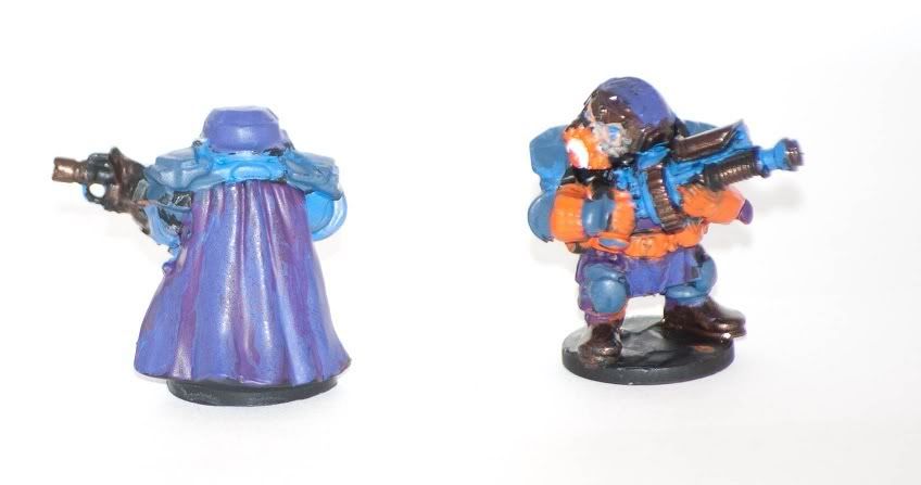
- Your color scheme isn’t the best. This is kind of a pain because a lot of time what makes sense as a color scheme doesn’t make for a good paint job. Look at the front view of that model. Where does the helmet end, and the shoulderpads begin? Likewise the knees and the interior of the cloak? Likewise the gun. It’s all very blue, with a couple of spots of orange thrown in.
- It doesn’t look like your coats are that even. There are places where the paint seems noticably thicker than others. In some spots I’m pretty sure I can see your base coat.
- It’s too shiny! Take some matte varnish to it; you’ll be shocked how big a difference this makes, especially in photographs. iirc I used to use Testors Dullcote.
Here is what I’d suggest, going forward:
- Thin your paints! When you think they’re too thin they’re about right. Yes this is a pain in the ass; it means you’re going to have to go with multiple coats. That’s the point. Multiple thin coats will ALWAYS look better than one thick coat.
1a) Understand how different layers of colors interact. Say for example you’re using black primer (very common). Painting yellow on top of black primer will take you approximately 300 coats. Slap a coat of brown down, and you’ll cover it in 2-3 coats oof yellow. - I used to always have some test models. This was especially true when painting GW plastics, when they were cheap. When I did my Imperial Guard army I probably painted up close to 10 test schemes. They weren’t full paintjobs; I was just laying colors on a model to see what looked good.
- Start practicing with some basic highlights, that’s the easiest way to make detail pop. Highlighting up is much much easier than shading down (although the results of the latter can be pretty spectacular). The edges of those shoulder plates are a PERFECT spot for this.
- Practice practice practice. It’s honestly the only way you’ll improve.
I have a much easier time shading down. Actually, I prefer to start with a light tone (over a white undercoat), shade it with a dark tone and highlight it with a super light tone on the edgiest edges. I think you need less coats like that, since shading requires less paint than highlighting.
But yeah, thinning the paint is super useful. Takes much longer, but don’t give up Buceph!
It’s not so terrible. The obvious things:
-
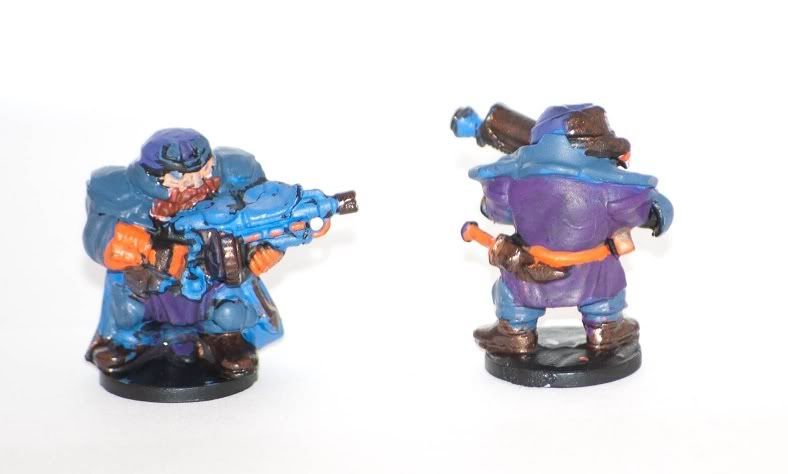
it looks like you haven’t managed to cover the undercoat in a few places. Getting your colour basecoat nice and clean is a great step in improving the final look of the model.
-
No real shading. Looks like you tried a little highlighting on the back of the cape, but you’ll get your real wins if you cover the whole model in one of the shading ink/washes that are sold for this purpose. From Games Workshop the Devlan Mud wash is one of the favourites as it goes alright on almost anything and will give you some instant depth.
-
Colour scheme. Purple and orange can work together but adding blue into the mix as well just muddles things up. With roughly this scheme I’d have kept the gun fairly metallic/dark, used purple for your large areas and made the detailing like the cap, kneepads, gloves, belt in orange. Generally fewer colours is better.
Keep at it!
From what I gather your method (white undercoat, shade down) is how pro painters do it. It produces amazing results; the few times I tried it it was fantastic. But it’s a lot more challenging and it also tends to take longer.
For someone who’s just learning I think it’s best to do the typical basecoat + highlight and go from there.
Oh! Here is an awesome tip.
For metals I used something called “armor wash.” iirc it was a mix of black, blue, and brown ink. I can’t remember the proportion, but a thin wash of that over a metallic would give you a really nice end product.
Also: Do try the Formula P3 paints. Vallejo & Citadel paints have solid pigment, which means you can only thin them so much before the pigment breaks up and it turns into a mess. The P3 paints used liquid pigment, which means you can effectively thin it down infinitely. This means that every color is potentially a wash, which is pretty cool.
The only problem I had with their paints was the metallics, they tended to be very gloppy.
Oh, and a fun pallet trick: beer bottle caps make for a fantastic pallet.
Before you try anything fancy, work on being neat. Neat but flat figures look 100% better than sloppy but shaded ones. As mentioned above, multiple thin coats are better than one thick one. Get used to the way that paint flows from your brush and you’ll be able to put exactly the right amount of paint in an area to cover it precisely in no time.
Try and make sure that there is enough definition in your colours, try to avoid using the same colour for different materials especially when those materials are adjoining each other. It can be hard to do if you have only a limited selection of paints but experiment with mixing to produce even slightly different shades and you’ll be ok.
Those definitely aren’t the worst first attempts I’ve seen but keep at it, keep asking for feedback and you’ll be amazed at how much better you get in a short amount of time. Showing other people your work and getting feedback is vital to improving as a painter.
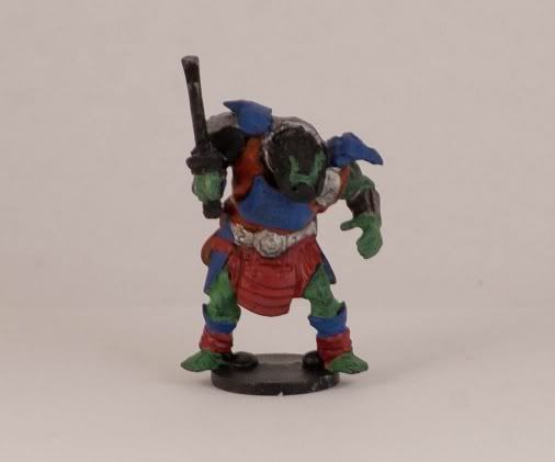
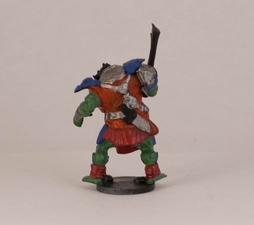
Thanks for all the help. I gave it another go tonight, except this time with Orcs rather than Dwarfs. I thinned the paint down a little more. Used less on each brush stroke. I can see some improvement with this model. I took a lot more time than with the other two. I think I spent three and half hours on it, only did one this time, and I haven’t even finished it. And even at that I rushed through the green at the end to give it some semblance of done-ness when I was getting tired.
I didn’t think I’d say this again considering I’m no longer 5, but staying between the lines is hard. As are vertices. I’m going to need to get a magnifying glass. It’s a lot easier to let yourself up on mistakes, but when I see the models at full magnification in a picture, there’s a lot of places I could drastically improve on. And most of all, I’m seriously impressed by what you guys have shown before. I always new it was difficult but I had no idea how hard it actually is.
Still, I think I’ve done better this time, and at least the paint scheme isn’t ridiculously horrid.
Here’s my latest project and this seems like a good place to put it as a work in progress.
I’m painting some Blood Angels Sanguinary Guard plus Commander Dante for a friend and I’m trying a zenithal highlight combined with a true metallic metal effect.
I’m still working on them but here’s what I’ve done so far.
First up, after the primer is an all over coat of Bestial Brown

Next I airbrushed on Chainmail downwards from somewhere above the right shoulder of the figure followed by a lighter spray of Mithril Silver mixed with a little Ivory.
I then glazed the whole figure with multiple coats of a transparent yellow with just a touch of Bubonic Brown in it.
This is the same miniature from two different directions. First the ‘shiny side’:

…and then the shadowed side:

The arms are being done separately:

Two figures will have both arms glued in (the sets of arms that are gripping their weapons in both hands), one figure will have the right arm glued on and the rest are magnetised so that the different weapon options can be swapped around.
Here’s the whole squad with Dante waiting for highlights and detailing - you can see the transparent yellow clearly on the wings of the rightmost figure:

I’ve got a fair bit to do on these yet but I’m excited at trying out new things on such beautiful models.
Those are definitely an improvement. To do vertices and small raised detail (like teeth or flanges) use the side of the brush rather than the tip. It’s much easier to keep the paint off the rest of the model and on the area you want to hit that way.
Mostly though it comes down to experience with the way that paint flows from your brush. When you mix paint up, always clean and dry your brush before you start to paint with it. That way you can be sure that you don’t have any errant water drops that might flood your miniature and you can be much more precise in the paint load on your brush.