After playing it a few hours I agree with your assessment. I liked MOO1 better than MOO2 as I found MOO2 too micro. So a decent update of MOO1 is what I’ve been looking for. Staying within that expectation I’d say this small development shop has delivered. I also like that I can select all my ships in combat and move/attack. Speeds up the battles and reduces the tedium somewhat from the MOOs.
Yeah, it basically seems to want to give you the whole 4X experience quickly and efficiently. I “won” my first post 1.0 game in about 90 minutes. Yet I still felt like I satisfyingly got all four of the Xs.
Is there an option for a goofball like me who prefers huge maps?
Yeah, you can have small, medium or large maps and also customize the amount of stars within those sized maps.
Damn all this positive word of mouth, I picked it up with my extra 10% humble discount. Hope to get a full game in tonight.
Ok, sold.
You guys are making it so hard to resist…
I only sunk an hour in last night, but its very enjoyable and has this light feeling to it of a fun 4x.
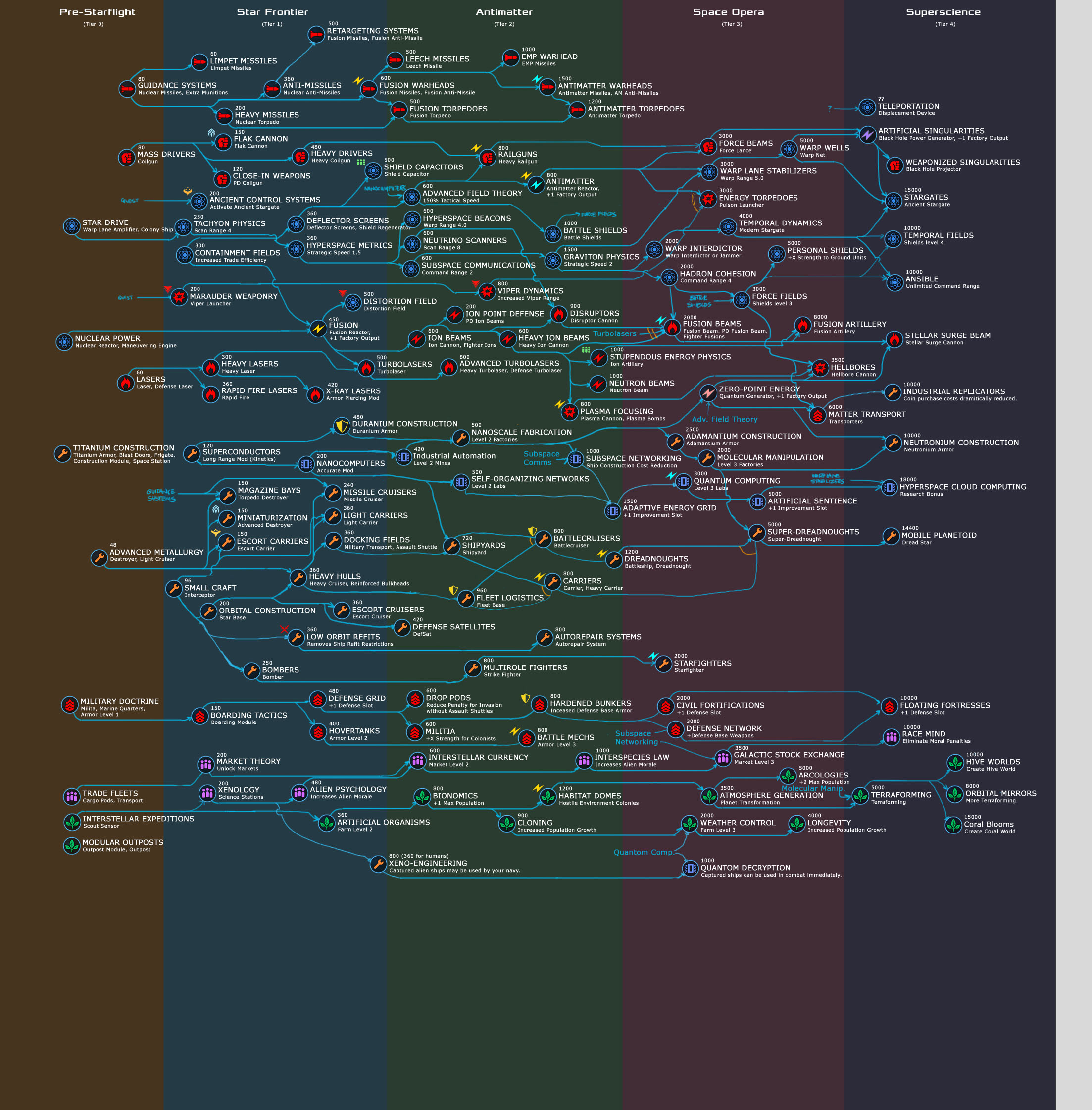
Question folks, is that research tree posted above, anywhere to be found in game?
Yes, at first I thought it was fan-made. But no.
I played my first game to completion and ended up losing to my ally in the council vote - I was in 2nd place. The game itself seems pretty good but I think it has some problems presenting information. I felt like I was doing an awful lot of clicking. It also felt awkward closing some of the displays, like the close button wasn’t where I expected it.
I also wish the game had a built in tech tree so it’s easier to see what leads to where. Also it would have been nice to more easily see what the capabilities of the ships were in battle.
I think it’s one of those game where once you put in the time and things become 2nd nature then some of these weaknesses would not be so bad. The question is with so many options for games to play do I stick with it long enough…
It’s a basic crime against good interface development to put exit buttons in different places on each screen. I think it’s the planet screen and the one behind it that always seem to confound me until I finally reach over and hit Escape on the keyboard. The most consistent way I’ve seen in opening/closing screens with the mouse is to click on the elements in the top toolbar even though that’s not a very obvious choice either.
Edit: I went and looked just to be sure. If you click all the way into the planet production screen, the exit button is on the right of that window. When you exit that window the exit button on the planet screen is a little further left. If you click on a ship to inspect the exit button is further left still. Clicking on a barren planet puts the exit button almost dead center top of the screen. That’s just newb interface development. I’ve seen veterans do worse though.
It’s 33% off for this week on Steam. Worth it?
Yes, very much so. I really liked it
me too. it’ll give about 15 hours of pleasure, and then some light-hearted gaming from then on. retro, well-made, not sophisticated, but hits the spot. if you buy it, it’ll help fund an expansion!
Haven’t been playing this, but I notice tech trees have been added with the latest patch.
And that was my exact question, time to revisit!
That could be useful!
Yeah, here’s a quick rundown. Looks great!
You bet your deep-space pinnace it could.