A lot. The short version is that Wumpus decided to leave the forum. For the longer version, his explanation was moved to P&R because it ended up being related to moderation and centered around activity there. If you’ve been oblivious to it, I would recommend savoring that! But that’s where you’ll want to go if you want more of the story.
Ugh. Yeah, I did miss a lot. Reading through the thread that apparently precipitated it now… bummer. See, this is why I avoid P&R :-P
I whole-heartedly advise against reading that thread.
I think I’ll take that advice. Tabs closed. Thanks Stusser.
Oh fuck yeah.
I ended up muting it and the thread that gman was in. The forums are less stressful now.
The new CSS for the front-page forum threads doesn’t seem to distinguish between topics that have been full read vs. those that haven’t. For other kinds of threads the title is either gray or black depending on the read status, for front-page it’s always black.
Any chance of a fix? I think the problem is that the black link color for the frontpage entries has been marked as !important, and overrides the other styles like that for “visited”.
tr.front-page-topic a.title { color: black !important }
I know this is probably at the lowest priority of the things to do but can we expect a Large Font for Solarized Dark theme anytime? :)
Wow, I really hate that.
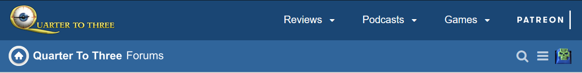
If we REALLY need to have the top bar, above the Discourse menu, can we at least drop the “Quarter To Three Forums” word beside the Home button so as not to repeat and looked cheesy? Perhaps just Home button and Forums?
I’ll take a look but there isn’t any simple mechanism to change the forum logo on a per theme basis.
Actually I am suggesting just removing the white “Quarter To Three” that is to the right of the House in a circle logo. Then, the words “Quarter To Three” does not repeat twice, as per my screenshot above.
I’ll just be blocking the entire bar in ublock origin, myself. Waste of space.
I get the desire to highlight the front page but the bar is a bit… big. If it were about half as large (with text and graphics scaled to match) I would probably like it more.
Yes I understood what you meant but the whole thing is a single image.
The bar is around 80 pixels high at the moment, halving it would leave the logo at 30 pixels high and its not legible at that size. I’ll continue experimenting with it though.
Can this graphic:

not easily replaced with just this graphic: